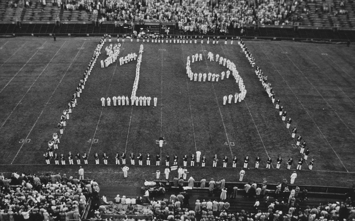


Campus & Community
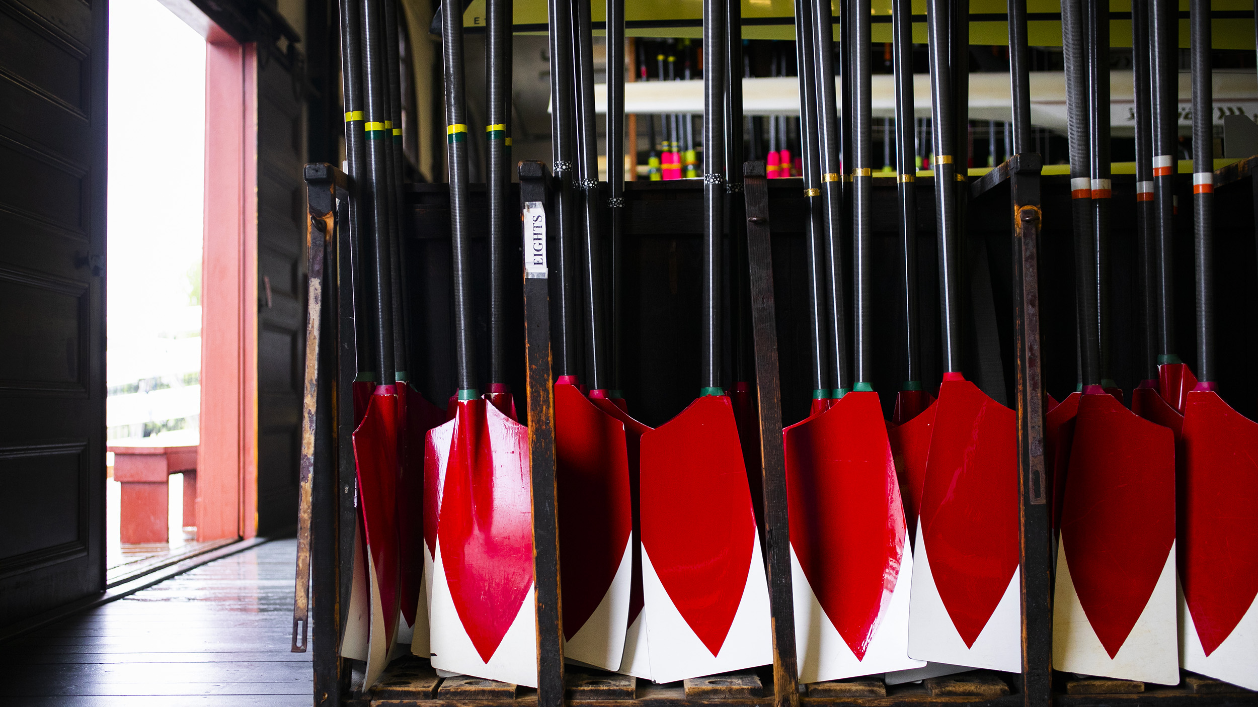
Blades of glory
Photos by Stephanie Mitchell/Harvard Staff Photographer
Just in time for the Head of the Charles, a definitive guide to the 19 designs on oars of University teams and clubs
Call it oarspotting. Harvard edition.
With the Head of the Charles Regatta this weekend, the Gazette has put together a definitive guide to the 19 blade markings used by the University’s crew teams and rowing clubs.
The insignias are, after all, designed to be distinctive so rowers can easily be identified and policed on the water, said Dan Boyne, Harvard’s director of recreational rowing. And like any other identifier — say, team jerseys — the embellishments allow crews to stand out as they propel themselves to victory.
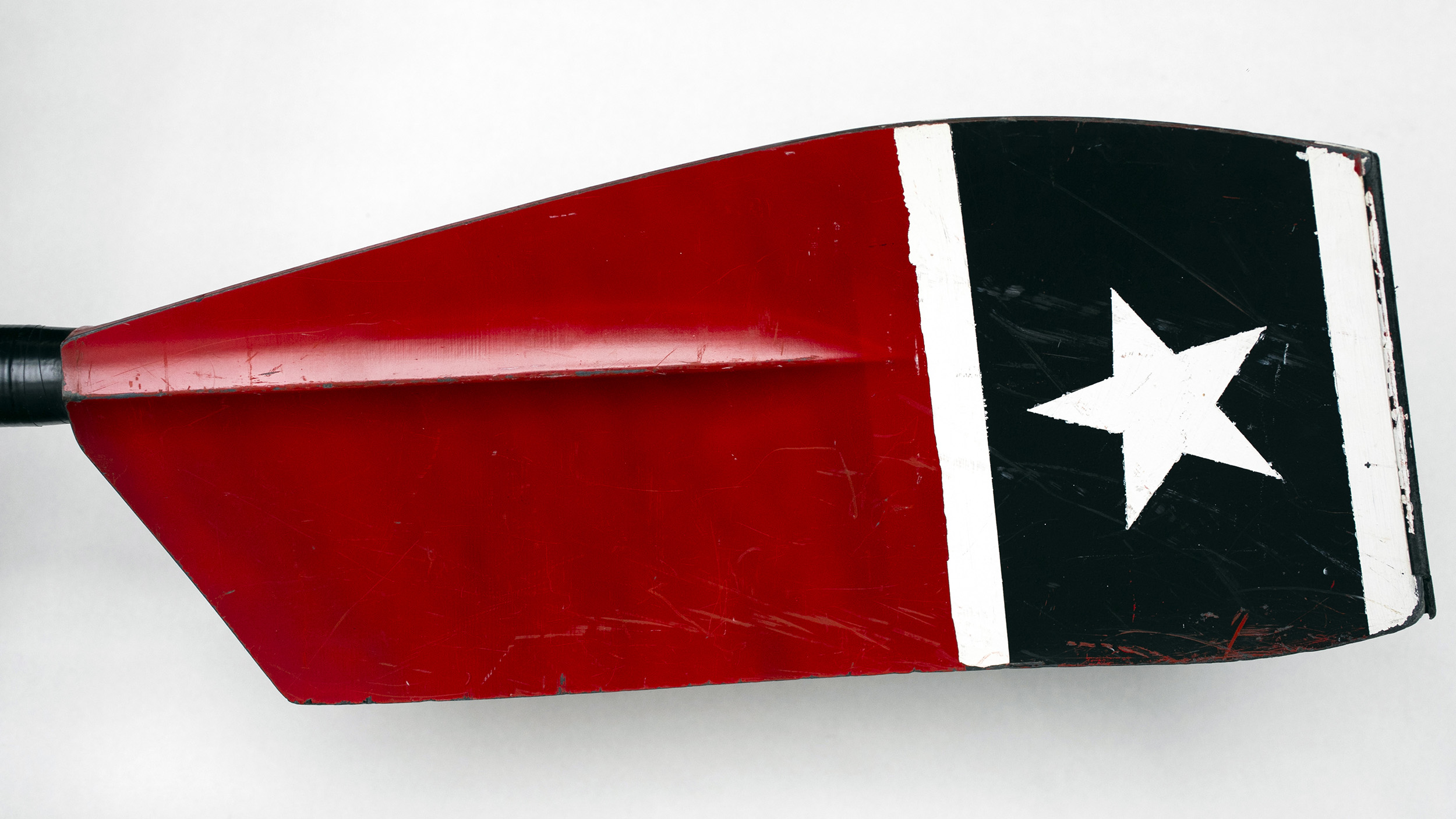
Take the men’s crew, for example. The crimson on their blades forms a pointed tip surrounded by white. If it looks like a flame, it’s meant to, said Joe Shea, the longtime Harvard boatman. The design goes back to the 1968 men’s eight team, which captured the U.S. spot for rowing in the Summer Olympics that year. Sometime before, the team changed the pattern to look like an Olympic flame for motivation. “At that point [after they qualified] all the oars changed over to that design,” Shea said.
The rest of the Harvard designs are mostly inspired by University colors, mascots, and shields distinctive to each School and House. Here’s an overview.

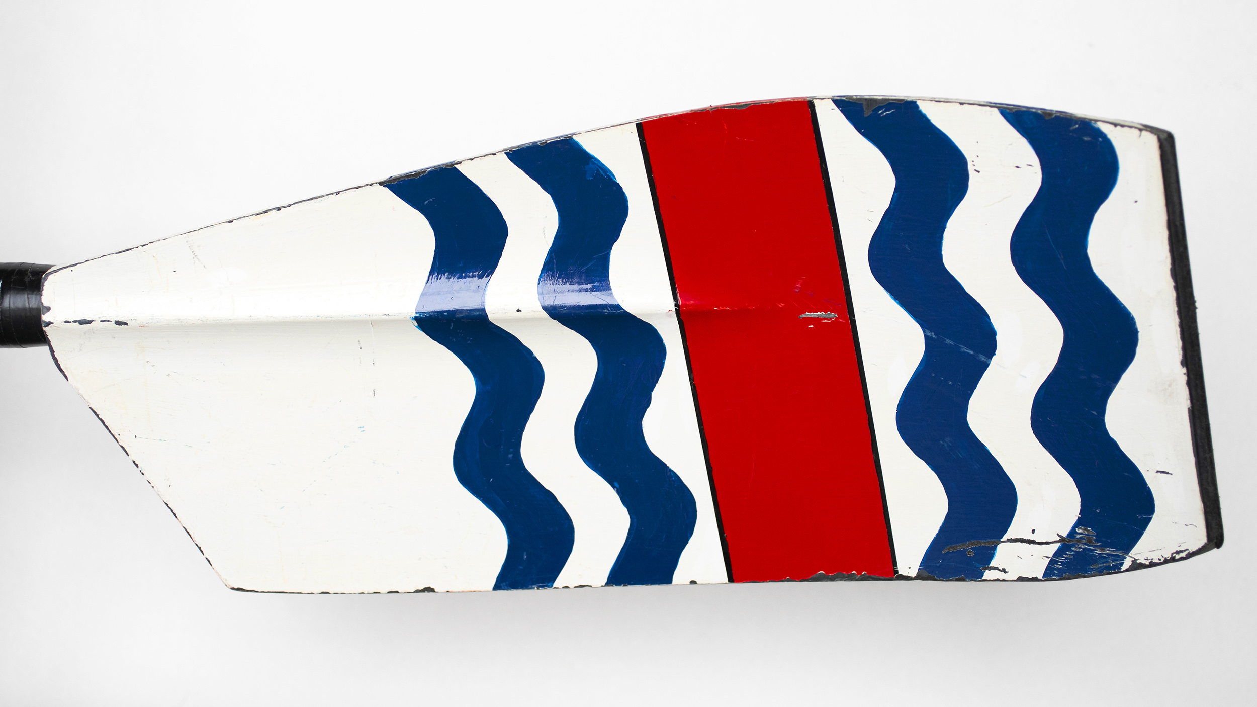
Radcliffe Crew
The black-and-white blade design is inspired by the Radcliffe crest and used by the women’s varsity rowing program for both heavyweight and lightweight divisions. Radcliffe Crew, which dates back to 1971, is the only women’s varsity team at Harvard that continues to compete in black and white under the Radcliffe name.
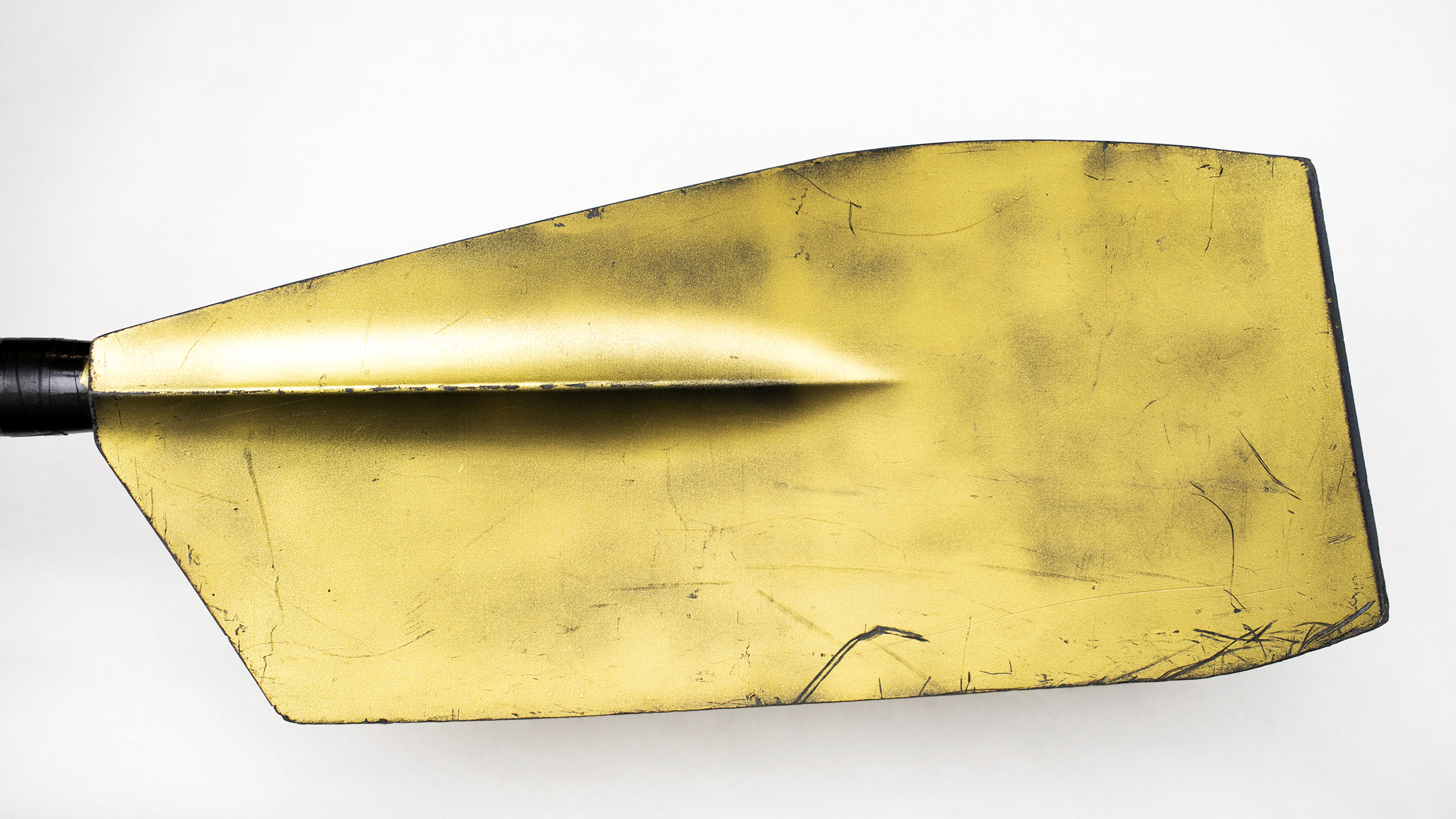
Adams House
Adams rowers wield a blade that reflects the residence’s gilt dome and the gold in its shield.
Cabot House
The design’s red and gold are pulled from the House’s shield and its fish mascot; the black is a nod to Radcliffe.
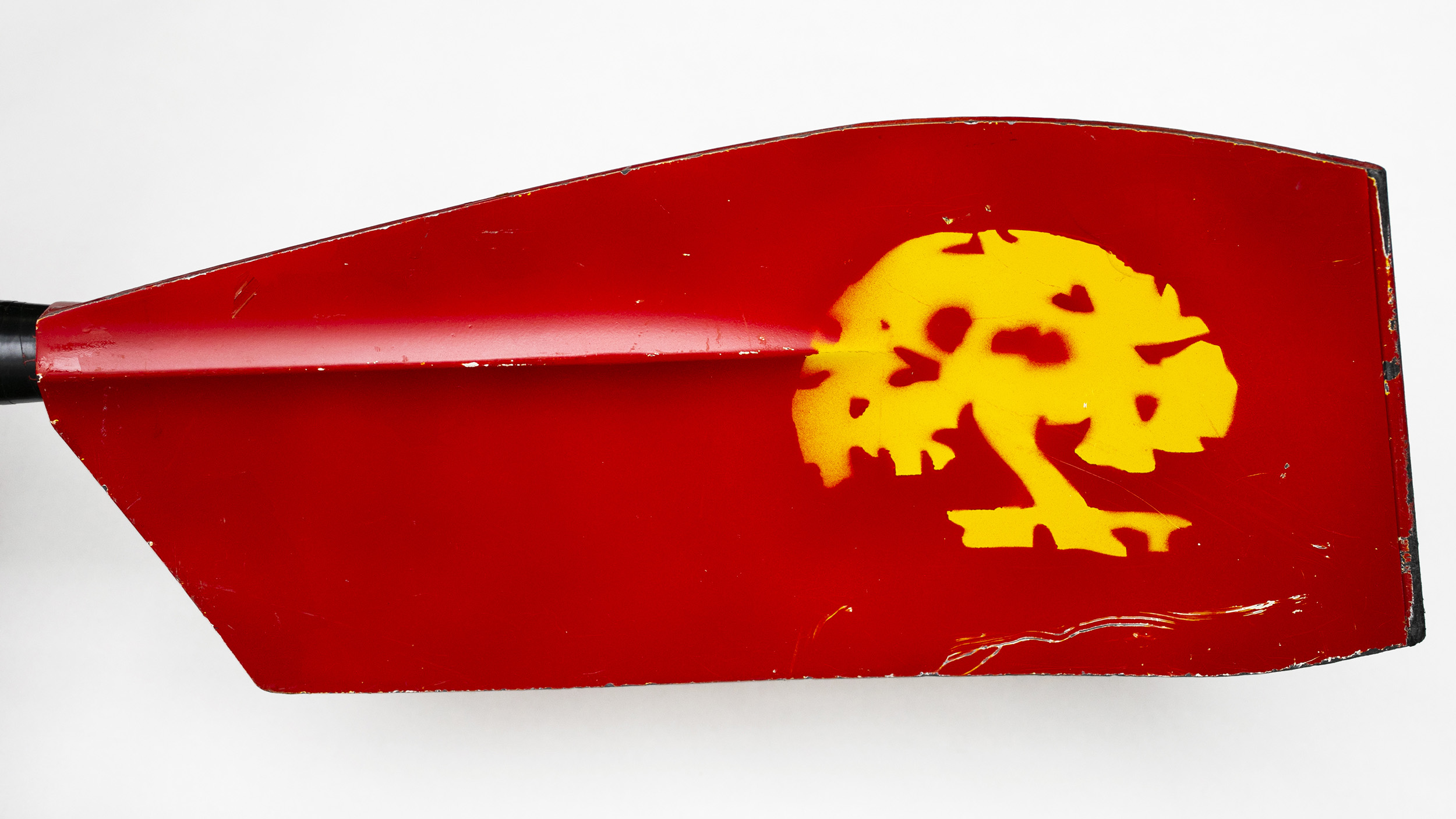
Currier House
This oar also draws from the House crest, a golden apple tree, representing the Radcliffe apple tree, against a crimson background, which represents Harvard.
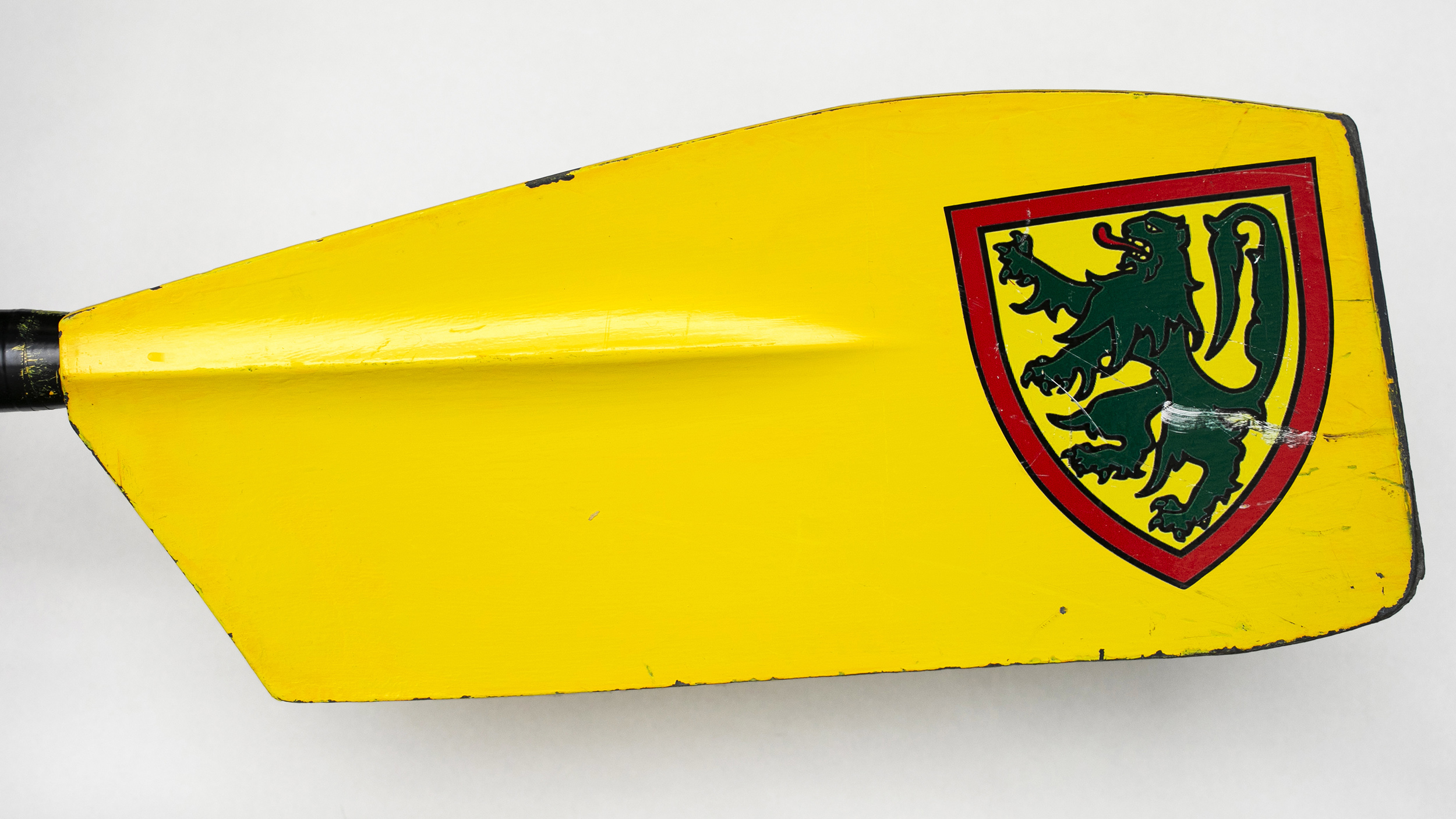
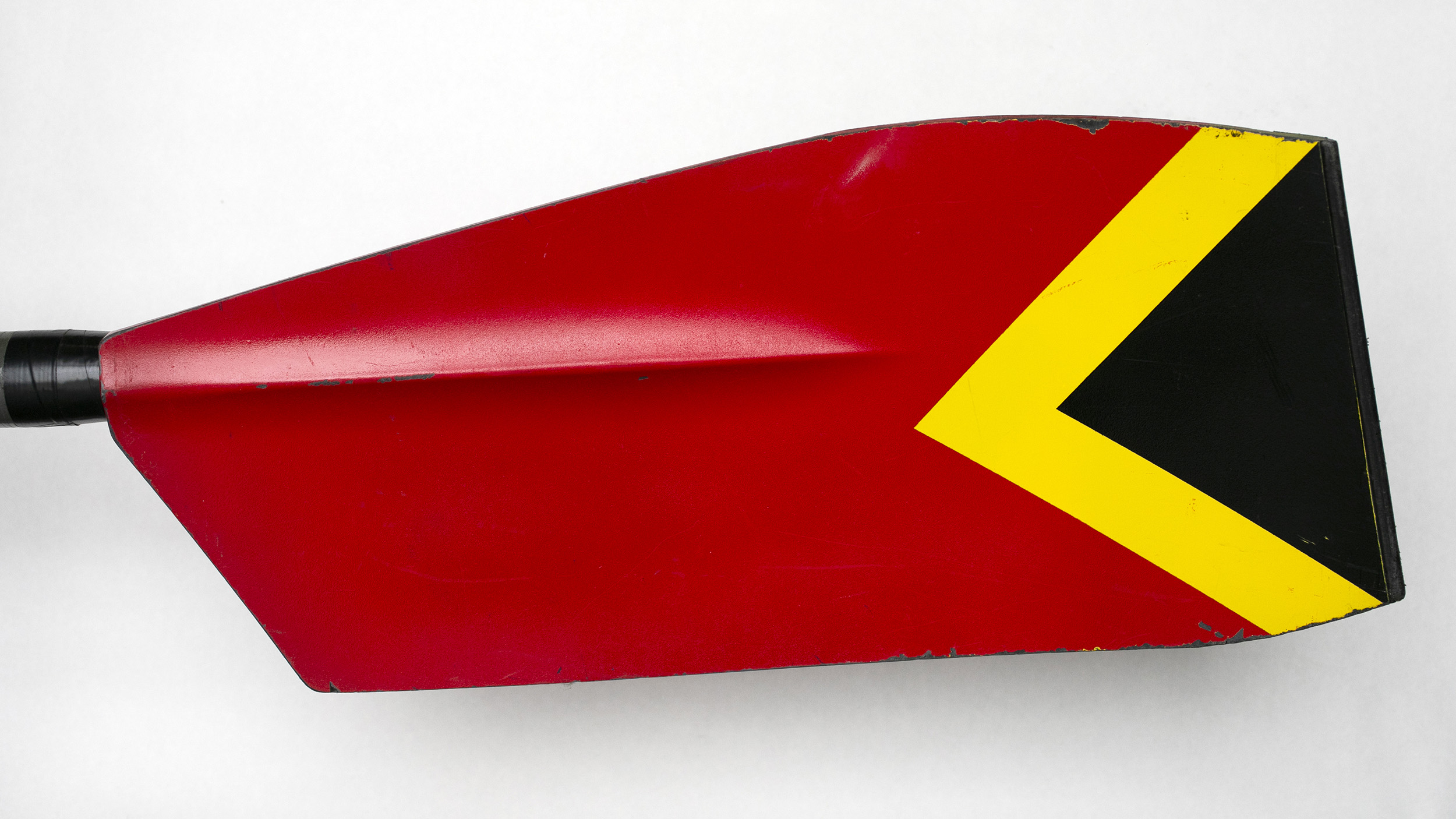
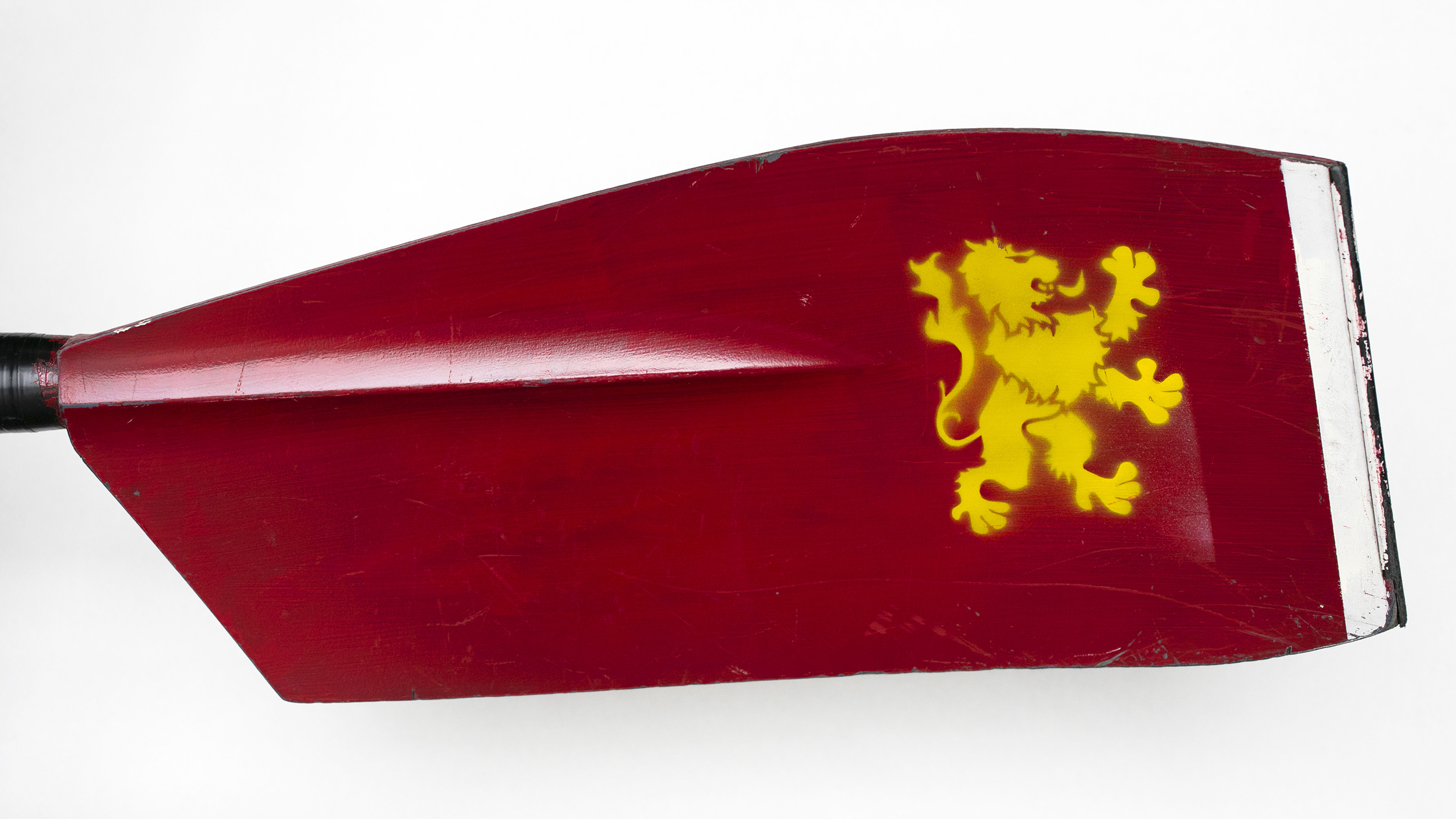
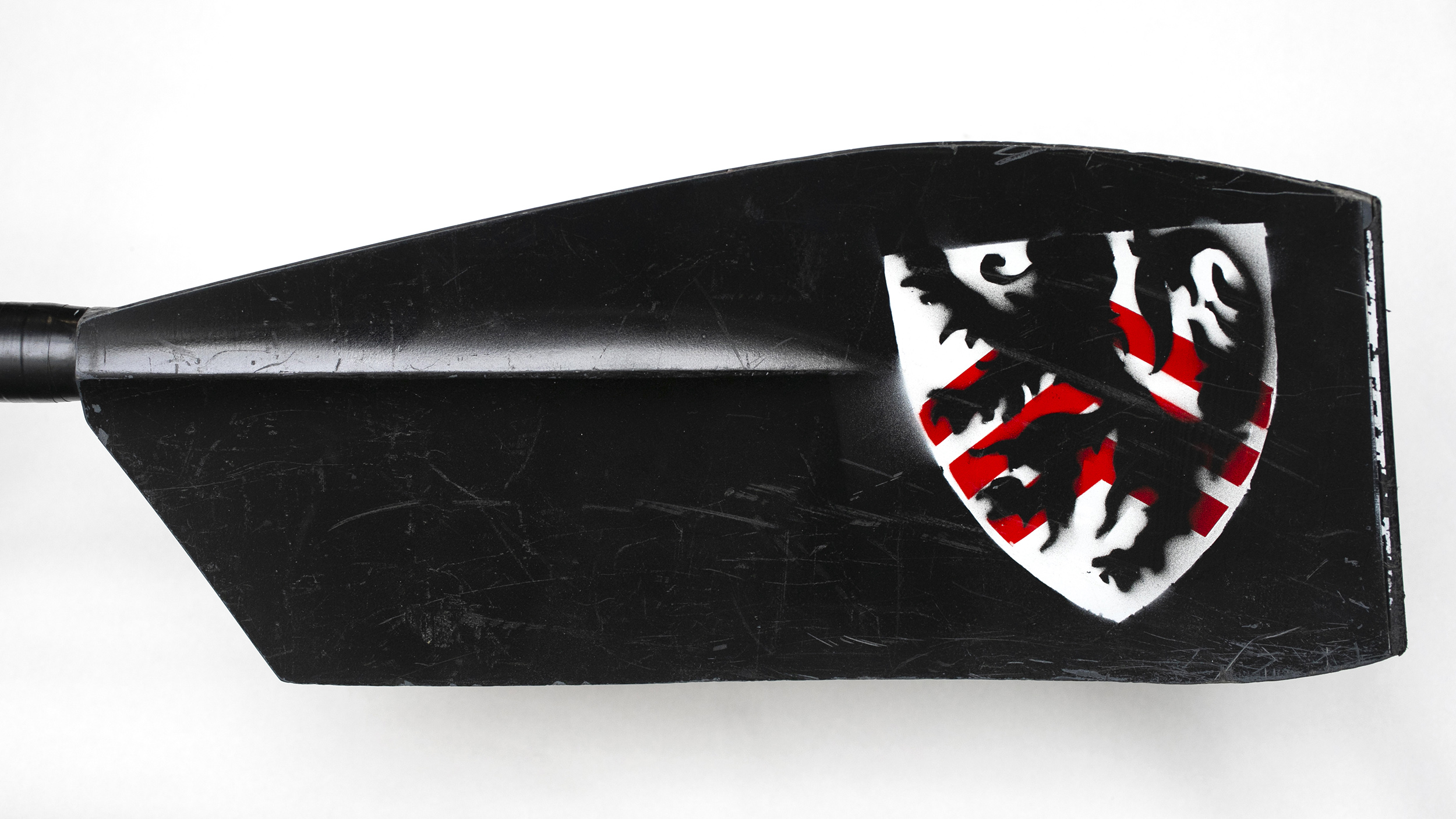
Dudley Community
The Dudley rowing club cuts through the water with a blade designed to closely resemble the House shield, a green rampant lion set against yellow.
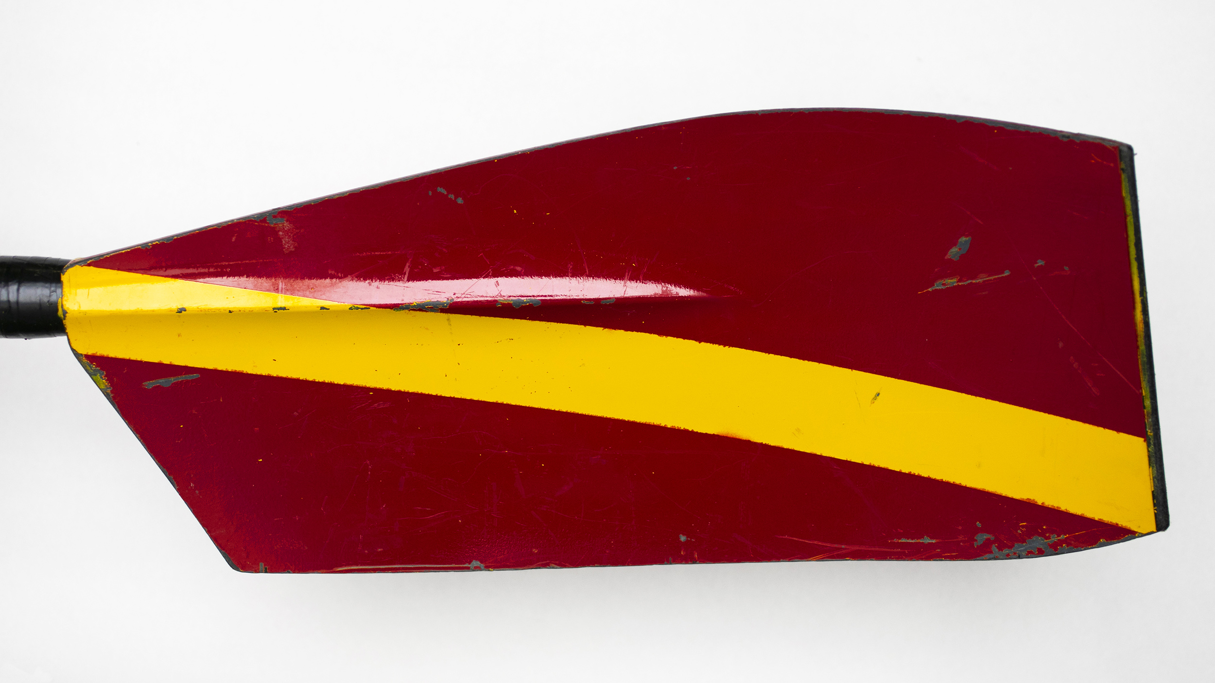
Dunster House
“It incorporates the same color red as the dome on Dunster’s clock tower, with a single yellow diagonal stripe across it,” said Michael Uy, the Allston Burr Resident Dean. “It is elegant and looks beautiful emerging out of the water with each stroke.”
Eliot House
Named after former Harvard President Charles Eliot (a rower himself), this House has a long history with the water. Perhaps because of its proximity to the Charles, a common misconception is that its shield, which the blade is based on, represents the river. According to the House website, though, it is derived from the Eliot family arms.
Kirkland House
Elements of the House shield, a black cross with three white stars set against a red field, appear in this design.
Leverett House
Leverett rowers ply the waves with oars that take its shade of green from the three rampant hares and inverted chevron featured in the House shield.

Lowell House
This blade’s shade of blue matches the Lowell bell tower, and its imagery echoes the residence’s coat of arms. “The clutched fist holding arrows on the shield itself has inspired the House cheer,” said William Doss Suter, an urban designer and campus planner in the Harvard Planning Office who oversees Lowell’s rowing team. “This imagery is reinforced each time a Lowell rower grasps the oar handle, with the rower’s clenched fists complimenting the arrow depicted at the end of each blade.”
Mather House
The back of the oar bears an “M,” a reference to the House’s “Fly the ‘M’” slogan for intramural sports. The front is based on the House crest: three golden lions on a white shield banded with red.
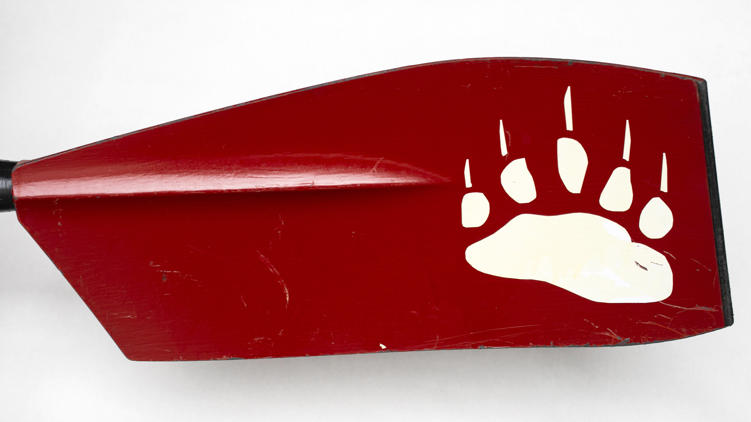
Pforzheimer House
In honor of its House mascot, Pforzheimer’s blade bears a large claw print.
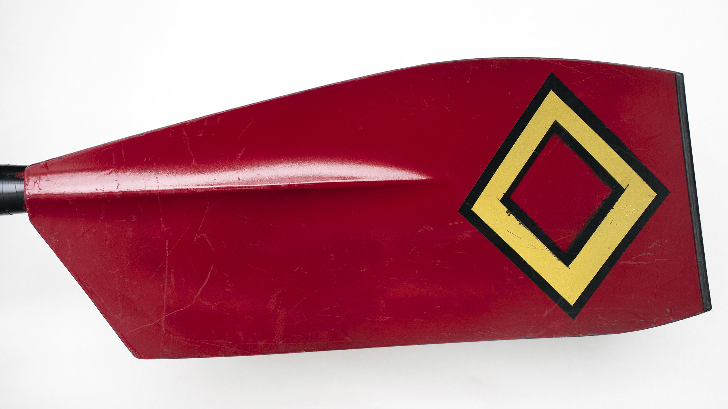
Quincy House
The design takes a strong cue from the House shield comprising seven diamonds.
Winthrop House
This design showcases the House shield itself, which features three red chevrons and a black rampant lion.
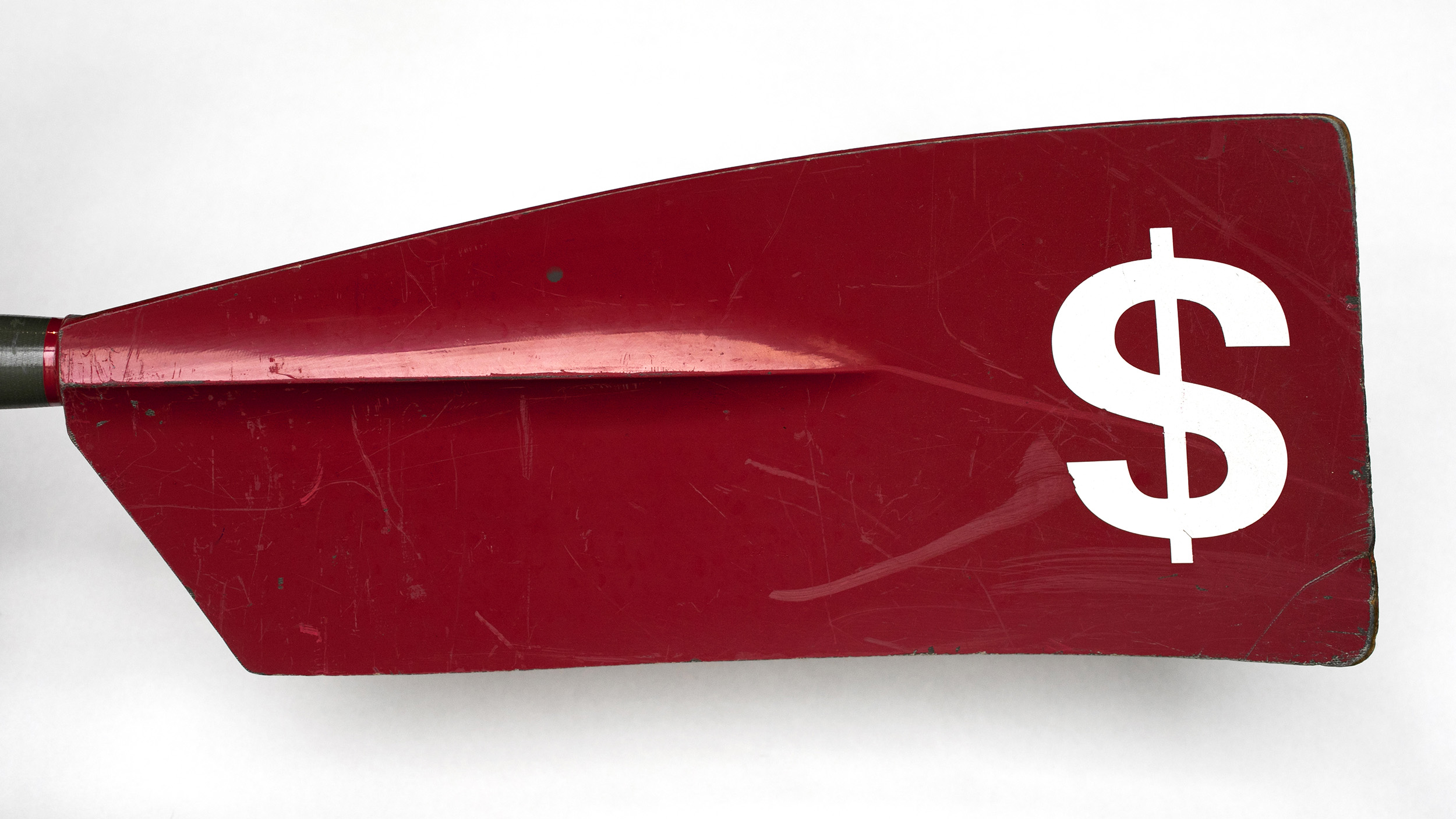
Harvard Business School
“I personally think it’s a fine and distinctive blade pattern fitting HBS, as the word ‘business’ is associated with capital/dollars anyway,” said Alexander Levinskiy, M.B.A. ’20, co-president of the HBS boat club.
Harvard Graduate School of Education
Though the team hasn’t been active the past few years, this design captures the School almost perfectly.
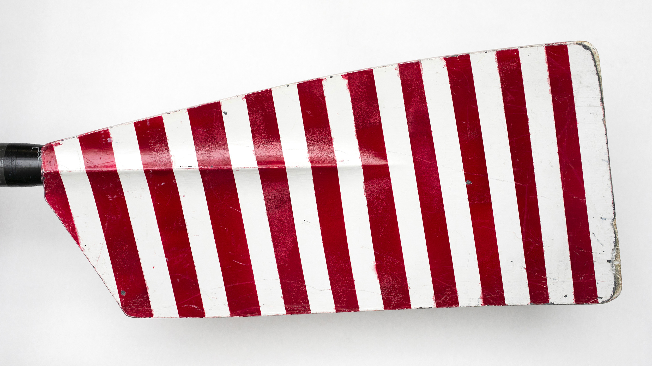
Harvard Kennedy School
The design, which dates back to 1999, takes elements from the School shield and the American flag.
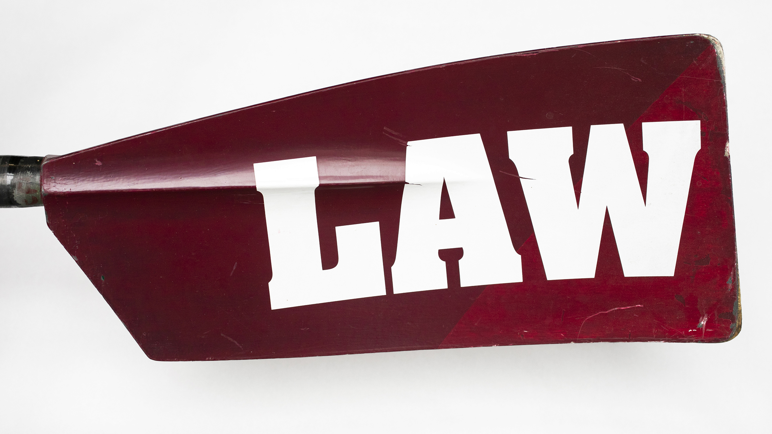
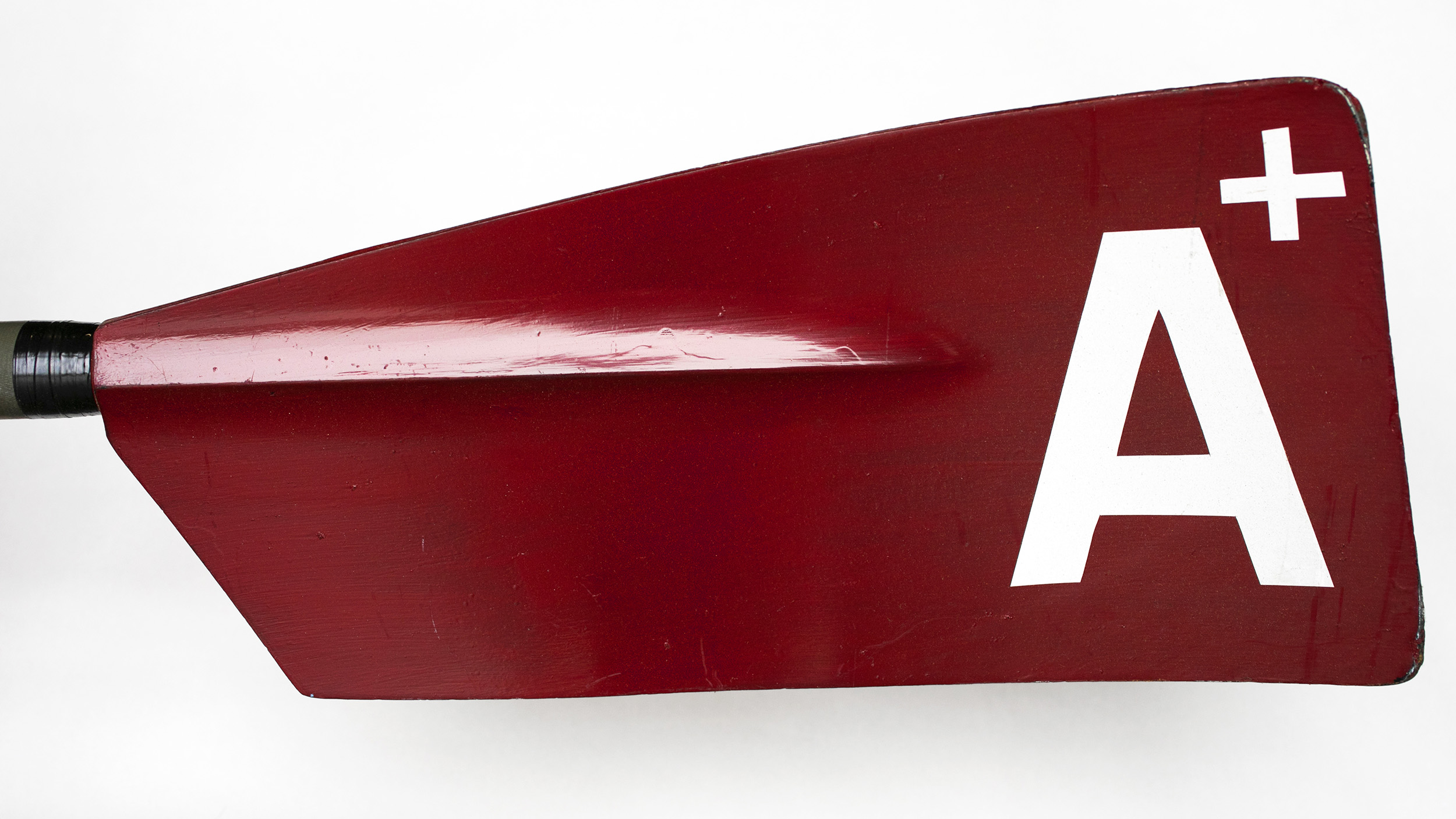
Harvard Law School
The Law School rowers ruled to keep its design as clear and concise as they are in the court room.