 Featured series
Nation & World
Correcting the world map
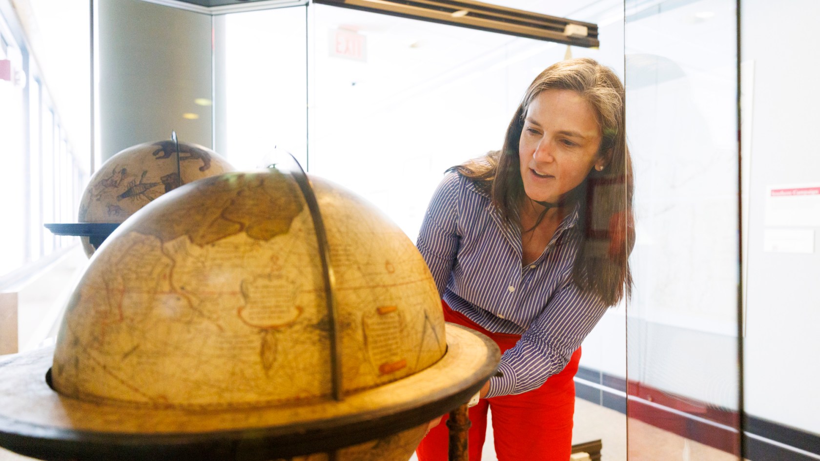
Molly Taylor-Poleskey rotates a 16th century Mercator globe at Pusey Library.
Veasey Conway/Harvard Staff Photographer
Scholars explain significance of U.N. vote endorsing new version that reflects actual size of Africa
Africa is about 14 times larger than Greenland. Brazil is five times bigger than Alaska. Canada and China are roughly the same size. But by looking at the Mercator Projection, one of the most widely used map projections, one wouldn’t know it.
Created by Flemish cartographer Gerardus Mercator in 1569 to help maritime travel in the 16th century, the Mercator Projection remains the world’s default map despite its glaring distortions. With its unique mathematical projection that determines the shapes, sizes and arrangement of the continents, the Mercator map has depicted countries near the poles as being larger than they really are for more than 400 years.
But the tide may be turning.
Led by a campaign of African countries, the United Nations recently endorsed a resolution promoting a new map projection, called the Equal Earth, which reflects the actual size of countries and continents, particularly Africa. The U.S. was the only country that voted against it.
For scholars of African studies, the news was a welcome change even if it ends up being a symbolic gesture. The U.N. resolution is not binding and doesn’t ban the Mercator projection, but the overwhelming support — a 164-1 vote — represented a victory for the African continent.
As flat representations of the earth’s spherical shape, maps tend to display some areas near the equator accurately while areas near the poles are often distorted, said Scott Bell, professor of geography and planning at the University of Saskatchewan, and research associate at Harvard’s Center for Geographic Analysis. No map is perfectly accurate, he said.
Equal Earth projection
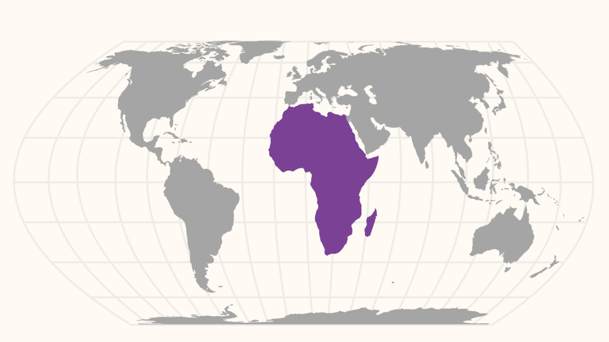
Illustrations by Liz Zonarich/Harvard Staff
Mercator map
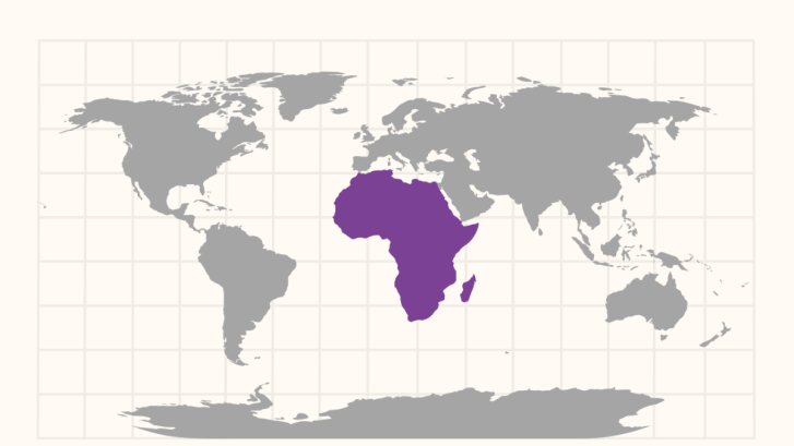
“When you take the surface of a round object and try to lay it flat, you’re going to have stark distortions,” said Bell. “Think of peeling an orange and try to flatten the peel, and you’ll see that you cannot flatten a sphere without stretching it. On the historic Mercator map, what is most accurate is at the equator, and as we move away from the equator, there’s more exaggeration in the portrayal of the places located in the north and the south.”
Areas near the poles indeed look distorted on a Mercator map. Alaska looks bigger than Mexico even though Mexico has a slightly larger land area. Scandinavia can also appear larger than India although India is nearly three times larger than Norway, Sweden, and Finland combined. And the U.S. appears roughly 1.5 times as large as it really is, with the greatest distortions in the northern states.
Developed in 2018 by cartographers Tom Patterson, Bojan Šavrič, and Bernhard Jenny, the new map shows Africa at its actual size. At 30.4 million square kilometers or 11.7 million square miles, Africa — the world’s second largest continent, covering about 20 percent of Earth’s total land area — could contain the U.S., China, India, and most of Western Europe within its borders.
“There’s something really beautiful and poetic in the simplicity of the adaptation that actually renders the spaces of various places more accurately,” said Zoe Marks, Oppenheimer Faculty Director of the Center for African Studies. “There is genuine enthusiasm and excitement about the global conversation on the visual misrepresentation and misinformation about the size and shape of Africa as a region.”
Maps influence people’s perceptions of countries and continents, said Bell. With the U.N.’s official support, the new map projection sends a strong message in favor of accurate representation, he said.
“The Mercator map reinforced the perceived importance of countries in the Global North because the Northern European and North American countries looked larger on the map,” said Bell. “It’s a map that has been in every classroom in North America, Europe, and across the world, and it was somewhat Eurocentric and dominated by the Global North.”
Originally, the Mercator projection map was intended for navigation. By preserving accurate angles and directions, it helped navigators chart a path by drawing a straight line on the map while maintaining a constant compass direction. These same qualities make the Mercator projection useful for displaying streets and navigation routes. Google Maps uses a modified version of it, called the Web Mercator Projection.
“The Mercator projection is very useful for a web map because you want your roads to be at the right angles, no matter where you are on the Earth,” said David Weimer, Ph.D.’16, former librarian for Cartographic Collections and Learning at the Harvard Map Collection. “It doesn’t matter if Greenland is too big if what you’re interested in is how to get to the nearest coffee shop. You’d want to know what direction the road is going. In that sense the Mercator is very useful; it’s not obsolete by any means.”
Another challenge to efforts to replace the Mercator projection is its ubiquity and people’s familiarity with it. “There is something deeply ingrained in us about maps being carriers of truth more than other types of texts,” said Molly Taylor-Poleskey, Harvard Map Collection’s map librarian. “It’s hard to let go of that kind of imprinting that we have from very early on.”
“There is something deeply ingrained in us about maps being carriers of truth more than other types of texts.”
Molly Taylor-Poleskey
There are only three original surviving copies of Mercator’s 1569 world map. Harvard Map Collection owns two original Mercator globes: a terrestrial one made in 1541, and a celestial one made in 1551.
It will take some time to get used to the new map and Africa’s true scale, said Marks, but it will help move the needle in discussions about Africa’s influence as a global power. It also signals the role Africa is likely to play on the world stage in the years ahead.
“Many African studies scholars, Africa enthusiasts, and thought leaders know already that this century will be the African century,” Marks said. “The future of humanity will be defined by what happens in Africa because it will be home to the world’s only growing population by 2100. Starting that trajectory with the right map is one small step toward rising to the occasion.”