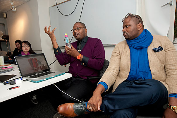
Identical twins Teman (left) and Teran Evans, both Harvard GSD alumni, have created a Friday afternoon seminar titled “Paper or Plastic: Re-inventing Shelf Life in the Supermarket Landscape.” Their first step was to send students into the aisles of area supermarkets for research. A shelf, they explained, is not a flat space. People move through stores in unexpected and surprising ways.
Photos by Jon Chase/Harvard Staff Photographer
Architects in supermarkets
Seminar inspires students to try their hand at designing products
The Harvard architecture students watched intently as Anne Liu presented slides of her preliminary design proposals. They were not for a house, or for a building, but for a jar of peanut butter.
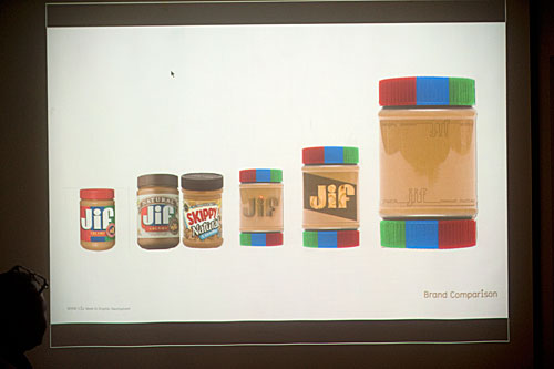
“The idea is that you are what you buy,” said the third-year master of architecture student. She illustrated her branding concept for Jif organic peanut butter: “Taste you can see. Purity you can trust.” She showed a container design for a jar with caps at both ends. She detailed her palette of colors, chosen to stand out against the peanut brown.
Liu was rejiggering Jif for an unusual Graduate School of Design (GSD) seminar taught in an unusual fashion by an unusual set of teachers.
“Paper or Plastic: Re-Inventing Shelf Life in the Supermarket Landscape” emerged from the obsession of identical twins Teman and Teran Evans, both Harvard GSD alumni (’04) who have expanded their architectural training into territory where their brethren almost never tread. The brothers believe that architects — with their skills in three-dimensional conceptualization — can address a host of design challenges, including ones that might sit on shelves in the local supermarket.
“That’s where the architect has suddenly so much agency,” said Teman. “We’re three-dimensional problem-solvers, and we can solve problems at the big scale of buildings that you occupy, and also small problems that fit in your hand.”
Since graduating from Harvard, the Evans brothers have a closeness that they parlayed into a business that does brand consulting and architectural design and produces a line of jewelry. Teran runs day-to-day operations in New York City; Teman teaches at the University of Michigan’s Taubman College of Architecture. Their work has been featured on HGTV, and the pair has appeared in reality TV shows.
They were inspired to create and teach a course for Harvard after an influential New York Times article declared the architect obsolete and said that an architectural degree was not worth the money.
“If you’re talking about brick-and-mortar buildings, yes, you could say things are changing,” Teman said. “But don’t say the skill set is obsolete. Because there are myriad problems we could apply this to.”
So the brothers contacted Preston Scott Cohen, chair of the Department of Architecture, and asked to create a Friday afternoon seminar that blends design, marketing, and business.
Their first step was to send students in “Paper or Plastic” into the aisles of Stop & Shop and Shaw’s supermarkets for research. A shelf, they explained, is not a flat space. People move through stores in unexpected and surprising ways. Products must also feel right in the hand when opened or poured. Products then “live” somewhere at home — on the table, near the stove, in a cupboard.
“Shelf life is more important in history than it ever has been before,” said Teman. Brands used to rely on the now-fragmented market of television commercials and newspaper circulars. Said Teran, “We are in an era where people no longer make decisions before going to the supermarket.”
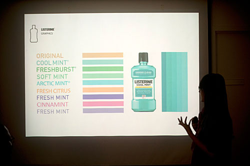
The students were randomly assigned to reimagine a classic product: Listerine, A1 steak sauce, Philadelphia cream cheese, or Jif peanut butter. For their final review, students will present ideas to panels of representatives from the architecture and branding world. “They have to treat these critics like clients. They have to learn to pitch their work,” Teran explained.
For her design, Liu first analyzed the peanut butter shelf in a market. She explored the effect of red, blue, and green against the brown of the product itself. She found that most organic peanut butter buyers routinely store the jar upside down, because the oil and peanuts tend to separate, and then the buyers turn it over to mix. She considered a jar that could grind peanuts with a twist and then settled on a double-capped jar to allow easy access.
Teman liked how Liu “doubled down” on the cap, but cautioned that the jar has to “live happily” in the hands of kids, mothers, and grandmothers. Teran noted that because peanut butter itself acts as the background color, that background could become “goopy” and unattractive as it is consumed. “It’s like a glass house,” he said.
Collin Gardner, a master of architecture student, presented his designs for A1 steak sauce, in which the bottle was reconfigured into a shape that incorporated an A and a 1. “I was trying to get some stackability,” he said.
The Evans brothers were intrigued, but they wondered how the design would pour and how it worked with the wrist. Would the product be shelved with, say, the Morton salt container, which is never seen, or “live” on a table with other condiments? They liked a design by GSD student James McNally for an A1 logo that put a knife design into the “negative space” between the A and the 1.
Christopher Esper and Dorothy Xu, both master of architecture students, were tasked with Listerine; Esper analyzed the “visual pollution” of Listerine’s current cool mint container, while Xu reimagined mouthwash in an elegant, spare bottle.
The brothers admit they exert push-pull on students. Teman, by nature, is more concept-oriented; he likes to throw out ideas and let the imagination spin wildly. Teran works on execution and practicality; he jokes that Teman calls him “the dream crusher.”
Thus, while they want their students to push barriers, they also cite the cautionary tale of Tropicana Orange Juice, which changed its branding and promptly lost $30 million in purchases by confused customers. “You want to update, but you don’t want to go from 0 to 60. You don’t want to lose those people that identified with the product,” Teman said.
The discipline of architecture may be changing, but Teman and Teran Evans promise their students one thing: “You will never look at the supermarket the same way again.”
