

Stephanie Mitchell/Harvard Staff Photographer
Campus & Community
Welcome to the new Harvard.edu
Redesign aims to make it easier to find news and information
After an 18-month redesign, Harvard this week launched its new homepage, a streamlined entryway to the University’s digital presence intended to ease navigation, provide information for students, families, affiliates, and visitors, and tell Harvard’s story, both of long tradition and of modern innovation.
The update to Harvard.edu, which attracts between 1 million and 2 million visitors a month, comes five years after the last one. Preparation involved a tremendous amount of user research and traffic flow analytics in an attempt to learn which elements of the former design were used most and which needed to be reconsidered. Planners also took a hard look at audience diversity and accessibility to ensure that anyone visiting the site can find the information they seek in a form that is useful to them.
Like all higher education sites, Harvard’s draws a significant number of visits from prospective students and parents seeking information, and the new redesign should make it easier for them to find their way to Harvard’s Schools and academic and administrative departments, where more detailed information can be found. It should also ease the way for those who come to the site seeking news and information from a trusted voice on a variety of topics, from sciences to the arts, business to politics, health to engineering, education to law.
A major goal of the redesign was to highlight the voices of Harvard: the faculty, staff, and students who populate the University and make it work.
“Our site visitors wanted Harvard’s people to tell our story,” said Melissa Lesica, director of content strategy at Harvard Public Affairs and Communications (HPAC), which runs the site and oversaw the redesign. “Instead of talking about Harvard as ‘Harvard,’ we’re talking about Harvard as ‘us.’”
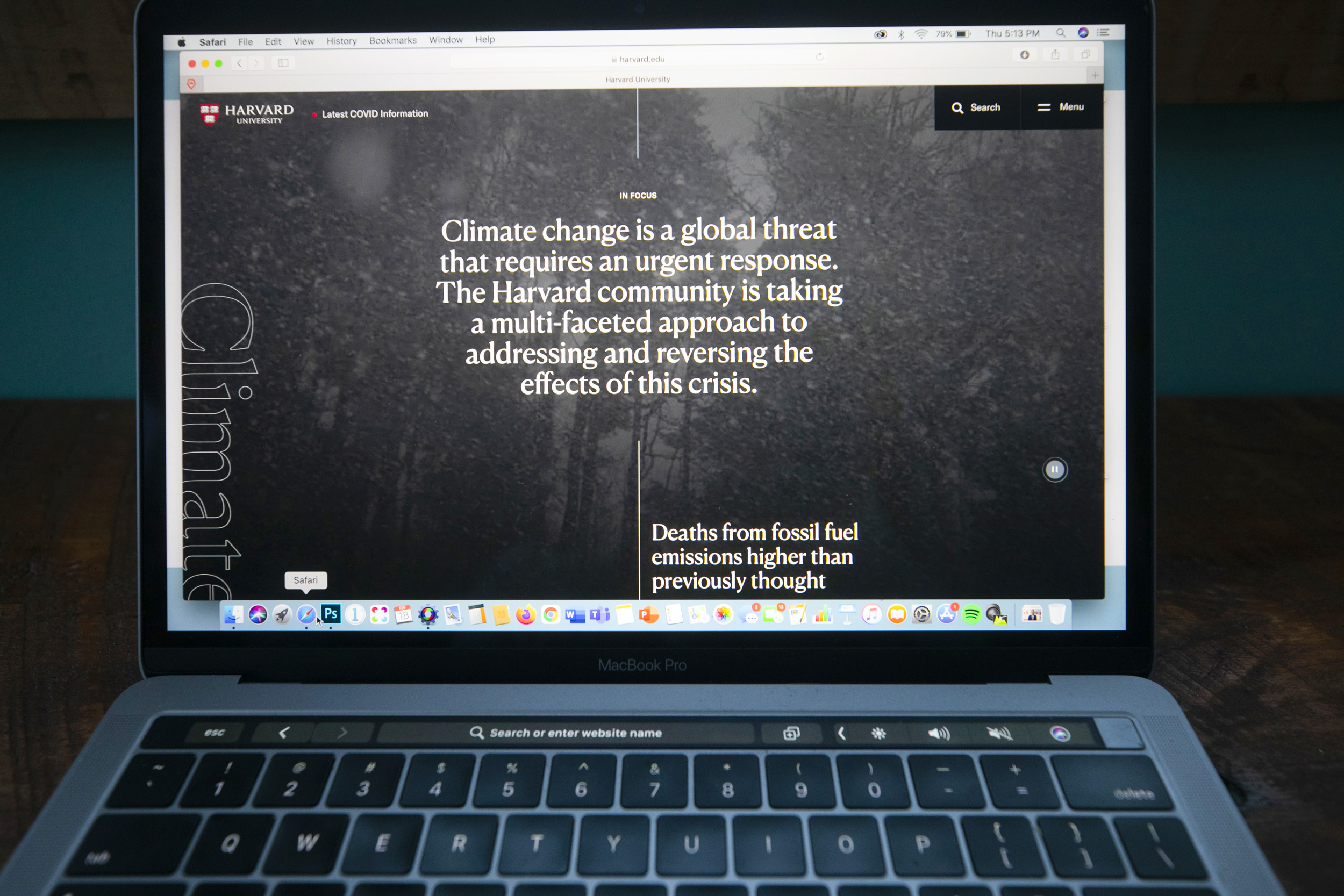
That’s why one of the six main menu categories (the others are Academics, Campus, Visit, About, and News) is something called In Focus. The feature provides an in-depth look at a single important issue, drawing on an array of media from across the University. It launched with the theme of climate change and includes dozens of related articles on new findings, profiles of researchers and students, suggestions for courses, and upcoming events.
The approach flips that of the old homepage. The previous version featured news from around the University on an array of topics, a “what is Harvard talking about today” approach, according to Lesica. This new one, she said, shifts the focus to University priorities — racial inequality in the democratic process is next — and offers an extended look at those topics.
Rather than changing daily, as the news content did for the old site, each In Focus topic will stay on the homepage for a week or two before giving way to the next.
Another feature is an expanded menu of academic programs that allows visitors to more easily locate specific departments, executive education, or nondegree programs. Aaron Baker, associate director of content strategy at HPAC, said the designers were surprised to find there wasn’t a comprehensive listing of programs across the University, so they had to contact each School to create one. The redesign was by the web design firm Modern Tribe, with user research and preliminary content strategy by OHO Interactive and messaging engagement led by the digital agency Echo & Co.