

Campus & Community
Style over substance:
Core course teaches visual display of quantitative data
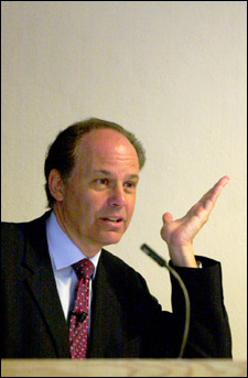
It’s going to rain Saturday, local meteorologist Harvey Leonard told members of the Core course “Quantitative Reasoning 46” on Thursday (April 24). Sunday’s weather won’t be so great either, he said, but in true New England fashion, Friday and Monday will be beautiful and springlike.
While the students appreciated getting up-to-the-minute weather information from a qualified source – Leonard, meteorologist for WCVB/Channel 5, has been one of Boston television’s most respected forecasters for almost three decades – they didn’t come to him for a weather report.
Instead, they were interested in how he showed the weather: What color was warm and what denotes cold? How do maps help us understand atmospheric patterns? Do graphics generated by satellite images, computer modeling, and Doppler radar trump looking out the window?
“The reason I asked Harvey to talk to our class is because I think he does a very good job in using graphics to explain the weather,” said Alyssa Goodman, professor at the Harvard-Smithsonian Center for Astrophysics (CfA) and teacher of QR 46. Called “The Visual Display of Quantitative Information,” QR 46 is less concerned with the weather – or the other statistical data it deals with – than how it’s presented visually.
Based on the work of Yale University Professor Emeritus Edward Tufte, the new course explores how graphs, maps, tables, and illustrations communicate quantitative data, which Goodman draws from medical, astronomical, social science, and financial sources, among others. Leonard, one of several guest lecturers, amplified work the class had already done on weather data.
A self-described “weather geek,” Leonard showed video clips from television weather forecasts of the 1950s and ’60s, when meteorology took a back seat to entertaining, stressing how far the field had come. One vintage clip showed a forecaster holding a hot dog against a map to indicate a front; another had reporters joking about the “weather string,” a crude forecasting device mounted in the station’s parking lot.
Leonard, on the other hand, has an array of Web sites, computer graphics, and animated satellite and radar images at his disposal.
“Think about the complexity of the weather,” he said, noting that it’s a three-dimensional spatial phenomenon, with time adding a fourth dimension. “You want to communicate information to people in a clear, logical, hopefully creative way,” he said.
Show me the data
Goodman – or Tufte – couldn’t have put it better themselves. Goodman, whose research at the CfA concerns observations and computer simulations of gases in galaxies, took a daylong workshop with Tufte in 1995 and “became a convert in one day,” she says. Tufte’s fanatical – “and I mean that in the best way,” says Goodman – approach to the clear, credible visual presentation of quantitative information resonated with her own experience as a scientist and her frustration with world-class researchers displaying their results in confusing ways.
“What they don’t appreciate is that people who aren’t as close to the subject matter, even if they’re brilliant professionals, could be made to understand what they’re trying to say a lot more quickly and a lot more effectively if they didn’t use 17 different black-and-white dotted lines on a graph,” she says.
The Core course, which is pitched toward those whose Harvard studies will likely not focus on math or science, sneaks mathematical principles like Leonard’s four dimensions into a practice almost every student will use in college or career: the presentation of quantitative data.
“Whatever you end up doing in life, you’re bound to do a presentation, whether it’s quantitative research or a sales presentation,” says Antoine van Oijen, a postdoctoral researcher in chemistry who is head teaching fellow for the course.
Goodman assigns project sets that challenge students to represent real-world concepts – like the weather or travel between Harvard and Kendall squares – in graphic displays. Along the way, the course discusses mathematical and statistical concepts like causality, approximation, scaling, averages, and confidence intervals.
Joining Leonard as guest lecturers were Web design guru Steve Krug and two Montessori elementary school teachers. Their demonstration of the educational philosophy that teaches children abstract concepts like size, weight, and addition through visual representation was one of the course’s most popular lectures, Goodman reports.
The course also teaches skills that may be more practical than many learned in Harvard classrooms: PowerPoint and a graphing program called Igor. Accustomed to teaching graduate interstellar medium courses, Goodman acknowledges that her QR 46 students’ enthusiasm for learning PowerPoint is disarming.
“There’s this mantra that Harvard is not a trade school,” she says. “But you can teach people grand principles until you’re blue in the face, but they really want to see how you do it. It’s kind of a mixture of the principles and the practical.”
Putting ideas first
Student feedback on QR 46 has been overwhelmingly positive, report Goodman and van Oijen.
“The unique thing about this class is so much of what we do is real-world examples,” says Michelle Borkin ’06, who plans to concentrate in astrophysics. Although she’ll continue to learn mathematical concepts, she’s found the course’s approach to display a helpful complement. “It’s much more about design than the mechanics of math,” she adds.
Still, Borkin is one of just 10 students in the class, far fewer than Goodman anticipated (only nine showed up on the course’s first day!). She and van Oijen are brainstorming how to boost the course’s numbers next time it’s offered, wondering whether the title or perhaps Goodman’s affiliation with astrophysics are scaring would-be students off. To her, learning how to visually convey quantitative data has universal appeal.
“They’re very simple principles, basically about putting ideas first and then trying to design graphics to present the ideas clearly,” she says. “It’s about how to make things blatantly obvious.”