
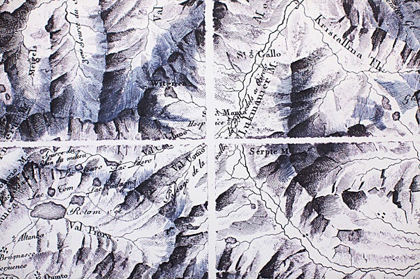
“Cartographic Grounds,” an exhibit at Gund Hall through Dec. 19, uses maps to show old and new drawing techniques. Sections of an old map of Switzerland (above) employ hachures — short lines used to depict an incline’s degree of slope.
Photos by Stephanie Mitchell/Harvard Staff Photographer
Arts & Culture
To understand, make a map
Exhibit outlines beauty of cartography, its evolution, and its digital future
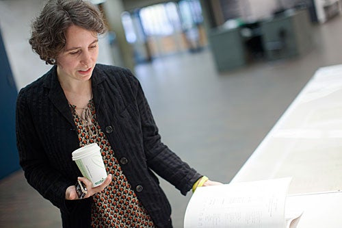
“Cartographic Grounds: Projecting the Landscape Imaginary,” an exhibit of new and old mapmaking at the Harvard Graduate School of Design (GSD), is meant to inspire a rising generation of designers to draw, with precision, what they see.
The show, on view at Gund Hall through Dec. 19, is also meant to give students a sense of the aesthetics that have been vividly present in cartography for centuries, but that may be muted in an age of 3-D representations of space. Curator Jill Desimini stood between a 13th-century map of the British Isles, on which settlements were marked with castles, and a flickering video made last month that stacked layers of geographic data. In defense of the modern age, she said, “It’s much more challenging to make something that has to work at so many different scales.”
Desimini, an assistant professor of landscape architecture, teaches “representation,” or how to render a design in two dimensions with pencil and paper, and how also to represent designs in 3-D for video and computer-aided design (CAD) scale models.
For those who are not students, “Cartographic Grounds” still has immense appeal, beginning with those aesthetics. “You can be immersed in a lot of beautiful maps and a lot of beautiful drawings,” said Desimini.
The map of the British Isles, for instance, drawn by Matthew Paris in 1250, is an artifact right out of fantasies both ancient and modern. It has a northern wall that is toothy with parapets, vague rivers that wriggle like blue worms, and at every border the void of a lime-green, soundless sea.
Then there are the simple history lessons that maps offer. In one glass case — where all the exhibit’s vintage artifacts reside — is a two-page spread, “Plate R,” from an 1873 atlas of Cambridge, Mass. The text beside it is a plea for the beauty that printed atlases (now a thing of the past) once offered. But the thing itself — with its soft yellows, pinks, and greens — is a lesson in the vanished. Jarvis Street and Holmes Place are gone now, part of a growing Harvard. North Avenue is now Massachusetts Avenue. And the wide-open spaces of local estates — rendered in a creamy white — have vanished too, along with their owners. Mrs. Horatio Greenough, a map reader will note, once owned the house where Gund Hall now sits, home to the new exhibit.
To students, the lessons of “Cartographic Grounds” are more textured. “It’s to encourage students to learn from cartography, and to draw precisely,” said Desimini, who was asked to assemble the show by GSD Dean Mohsen Mostafavi and by Charles Waldheim, chair of the Department of Landscape Architecture. “We’re training professionals, and the amount of hand-drawing has waned.”
She said the show allows students to observe the “dialogue between the plan and the map — the precision of the plan and the terrestrial reach of the map.” Designers increasingly tackle projects that cover city-size areas, said Desimini. “They’re entering the scale of geography,” but have to retain the precision of designs that are, for instance, the size of the old Greenough house.
Any mapmaking, she said, involves learning how to depict the ground, in representations that could be as stylized as Paris’ English rivers of 1250, or as linear and precise as the Los Angeles road map just a few feet to the right. Modern maps often depict the nonphysical too, such as political forces. But the main idea of the exhibit “was to recapture how you draw the ground,” said Desimini.
On the sections of wall painted light gray, the exhibit outlines four main ways to map physical space: “subsurface inventions,” like layers of rock; “temporal itineraries,” like roadways that correlate time and distance; “aqueous explorations” that chart coastlines, seas, rivers, and other interfaces between land and water; and “terrestrial practices,” representations of land cover that vary according to a mapmaker’s culture and era.
Within each theme is another layer of learning: 11 drawing conventions outlined on Plexiglas panels. Design students can apply these. Viewers can simply marvel at the rich lexicon of the ways that maps are organized and drawn. Within the idea of subsurface inventions, for instance, is the familiar stratigraphic column depicting layers of rock. This was a revolutionary idea in 1815, when William Smith published the first nation-scale geological map, depicting the fossil-rich subsurface layers that created Britain’s contours.
Add to that the cross section, a mapping convention so familiar that it is now all but invisible. The exhibit includes a whimsical view of a South American mountain, with a verdant outer layer on one side and a mountain of words on the other. This is an 1802 botanical map by Alexander von Humboldt, meant to show how plant distribution was affected by elevation.
And so on. The rest of the show offers lavishly illustrated lessons. There are the line symbols and conventional signs of temporal cartography, where precision overwhelms the need to show how a place looks from the air. A Federal Aviation Administration map of Los Angeles, for instance, replaces the look of a place to reflect the first imperative of air travel: Know where the ground is.
In maps of the aqueous world, there are soundings and isobaths and spot elevations, including a water-depth map of a Dutch river in the 1730s.
Then there are the hachures, shaded relief, and other conventions used to depict the terrestrial landscape. Quite logically, this is the biggest part of the exhibit, because ground maps have dominated cartography from the beginning. This is also the area of cartography where the past most strikingly meets the future. There are maps painstakingly mapped on foot by a surveyor. And there are maps derived from satellite technology, including a video display that allows the viewer to “fly” across the world at a bird’s-eye level.
But wait: hachures? Yes, Desimini is the first to admit that some venerated terrestrial drawing techniques have fallen out of favor. One example is hachures, the short lines once used as a variation on shading to depict slope. Still, said Desimini, “I’m enamored of the way they look.”
But aesthetics are alive and well in making maps, she added, showing a visitor her “favorite design pairing.” On the left was a 1938 depiction of the Alps by Swiss cartographer Eduard Imhof, who believed that math-driven depictions of the same scene failed to capture their complex materiality and grandeur. The result, though informed by aerial pictures and scale models, was a shade-relief system of representation that seems painterly.
“How do you get the ground to look like the ground from the air?” asked Desimini of Imhof’s effort. “He took out all the lines.” On the right was a 1982-83 wash painting of Hong Kong by architect Zaha Hadid, another shaded-relief view that blends science with art.
In the spring, Desimini will resume teaching representation to design students. For now, with lessons for everyone, there is the exhibit.
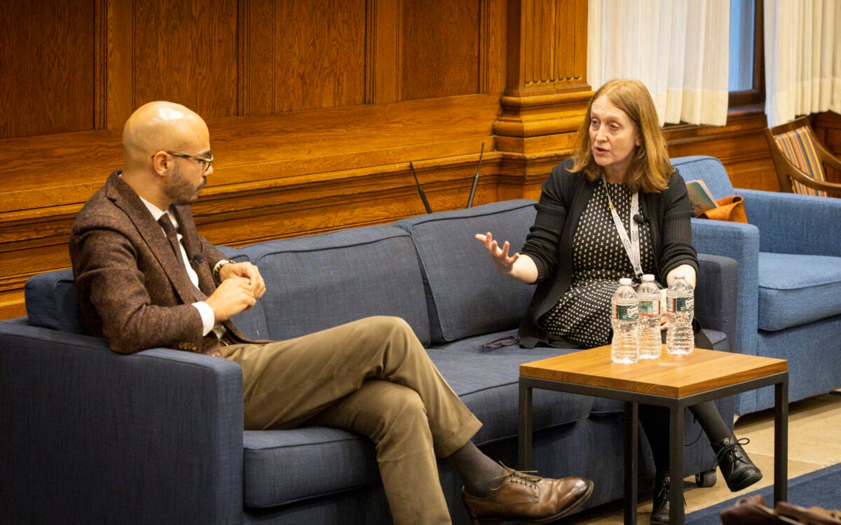
A panel discussion on the exhibit will be held on Nov. 28 at 6:30 p.m. For more information.