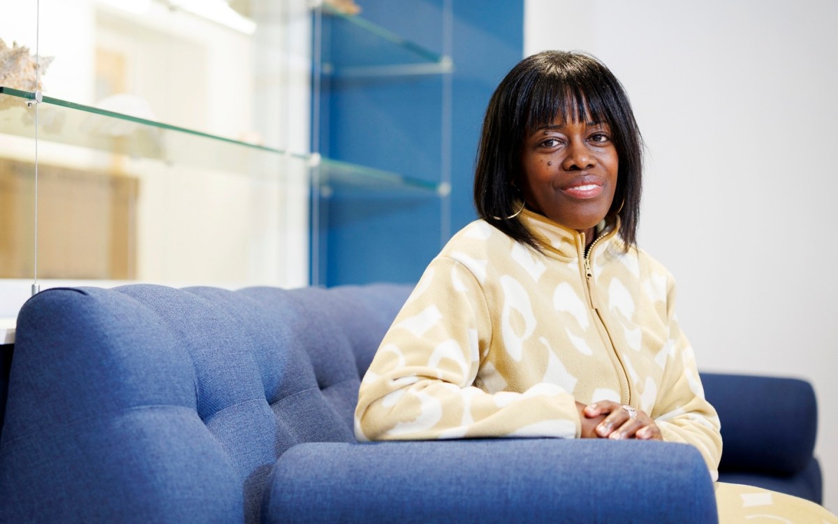
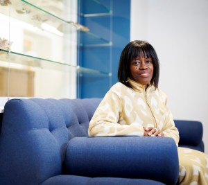
At a conference that cast a fresh look at data, artist Nathalie Miebach translated weather data into musical scores and sculptures (photo 1), GSD student Krystelle Denis (right, photo 2) showed a visualization pattern of historic data from the Arnold Arboretum, and graphic facilitator Kelvy Bird illustrated each presentation as it happened (photo 3).
Courtesy of Nathalie Miebach; photos by Enrique Diaz and Beth Giudicessi
Science & Tech
Grasping with the eyes
Data gains power through graphics and charts, specialists say
It seems like big data is everywhere you look. And in a way, it is: Maps, medical scans, and weather charts are commonplace forms of data visualization. Each was examined during “Thinking with Your Eyes,” a two-day conference that brought together experts in the arts, sciences, humanities, and technology — as well as academic and computing groups from across Harvard — to investigate how graphic representation brings knowledge to life.
“In a technological age where large amounts of data can be captured like never before, how big data is used and portrayed presents significant challenges,” said keynote speaker Martin Wattenberg, who along with Fernanda Viégas leads Google’s “Big Picture” visualization research group.
Author James Davenport, who created the popular “The United States of Starbucks” graph that shows that 80 percent of Americans live within 20 miles of a link in the coffee chain, pointed to the potential for wider impact. “Visualization makes technical information available to everyone,” he said, adding: “We love to study ourselves. Data is never boring when it’s about us.”
Studying ourselves — and condensing that information into pictorial form — is not new. “The history of art fundamentally is also the long history of visualization,” said Jennifer Roberts, the Elizabeth Cary Agassiz Professor of the Humanities.
“I never think just with my eyes. I think with my hands, as well.” — Nathalie Miebach
In a panel discussion, Roberts, who teaches a course called “The Art of Looking,” traced the Google Maps interface to Gerard Mercator, the Flemish cartographer who devised a cylindrical map projection that distorts the shape of large objects, such as the poles and some continents, to preserve the angles of smaller ones. The projection is still used today. “It’s interesting to think that as you’re navigating around using Google Maps on your phone, you’re actually activating a visualization that was designed for now-obsolete navigation techniques for 16th-century sailing ships,” she said. “So there’s a bit of salt and spray and shiver-me-timbers deep in your iPhone.”
Michelle Borkin, a doctoral candidate at the Harvard School of Engineering and Applied Sciences, tapped her background in physics to create a tree diagram for diagnosing and treating heart disease. The diagram is based on a similar illustration Borkin used to plot the structure of nebula, which was influenced by a bioinformatics image of gene sequencing. In turn, the gene sequences were derived from Charles Darwin’s graphic of the evolution of species, which took its cue from an early figure showing the evolution of language.
“Straight from linguistics through biology and biophysics and astrophysics back to medical imaging,” Borkin said. Her interdisciplinary approach reflected the conference’s many contributors, a list that included Harvard College Library, Harvard Library, Harvard Art Museums, HUIT, HarvardX, the Office for Scholarly Communication, the FAS Academic Technology Group, and the Radcliffe Institute for Advanced Study.
As presenters acknowledged the long and cross-cultural history of visual representation, it was often in the context of seeking new ways to make information more memorable.
“How would our understanding of data change if we could actually touch it?” asked artist Nathalie Miebach. Miebach collects data on weather patterns and translates it into woven baskets, sculptural installations, and musical scores. “I never think just with my eyes. I think with my hands, as well,” she said.
Across Harvard, organizations such as the Initiative for Teaching and Learning aim to understand modes of thinking to strengthen the science behind learning, and to put that understanding toward research and better, more accessible tools for data manipulation.
“This, by definition, means making use of scientific information and big data to inform our pedagogical decisions, both of which are often best distilled and understood through robust and diverse visualizations,” said Vice President for the Harvard Library and Roy E. Larsen Librarian for the Faculty of Arts and Sciences Sarah Thomas. Thomas introduced the event’s closing keynote, Vice Provost for Advances in Learning Peter Bol.
“What’s interesting about data visualization is this whole idea of people learning,” said Bol. “You have to learn to see. Once we’ve learned to read a scatterplot we remember how to read it. Once we’ve learned how to read a map, we remember how to read it. There had to be a point in history when people didn’t know what maps were, and they began to learn.”