

Arts & Culture
A wall of color, a window to the past
Curious visitors who turn left off the Harvard Art Museums’ elevators on the building’s fourth floor are greeted by the Forbes Pigment Collection, a floor-to-ceiling wall of color compiled from about 1910 to 1944 by the former director of the Fogg Museum.
Stephanie Mitchell, Harvard Staff Photographer
Forbes pigment collection serves as teaching tool, resource, and even artwork
As brilliant as any of the works in the Harvard Art Museums’ galleries is a rainbow of small glass jars on the building’s fourth floor.
Curious visitors who turn left exiting the museums’ elevators will see the Forbes Pigment Collection, a floor-to-ceiling wall of color compiled between about 1910 and 1944 by the director of the Fogg Art Museum.
“In thinking about the role of a university museum, he was the first to conceive of it as ‘a laboratory for the fine arts,’ ” noted research curator Francesca Bewer in her book “A Laboratory for Art: Harvard’s Fogg Museum and the Emergence of Conservation in America, 1900–1950.”
Edward Forbes’ fascination with a painting’s colors and their binding medium — a close inspection of which could help to determine a work’s authenticity — fueled his desire to use science to understand and study great works of art. He is often cited as the father of the field of art conservation in the United States.
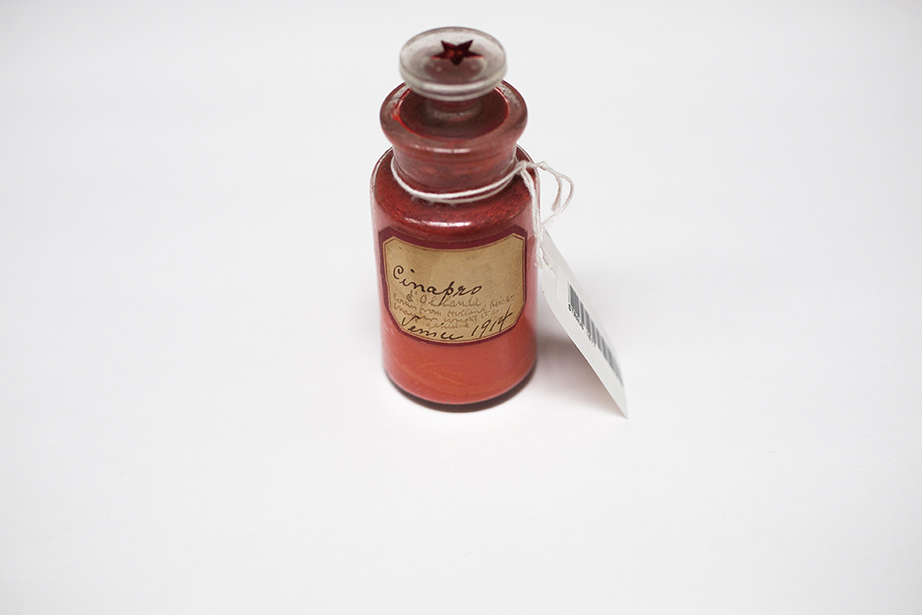
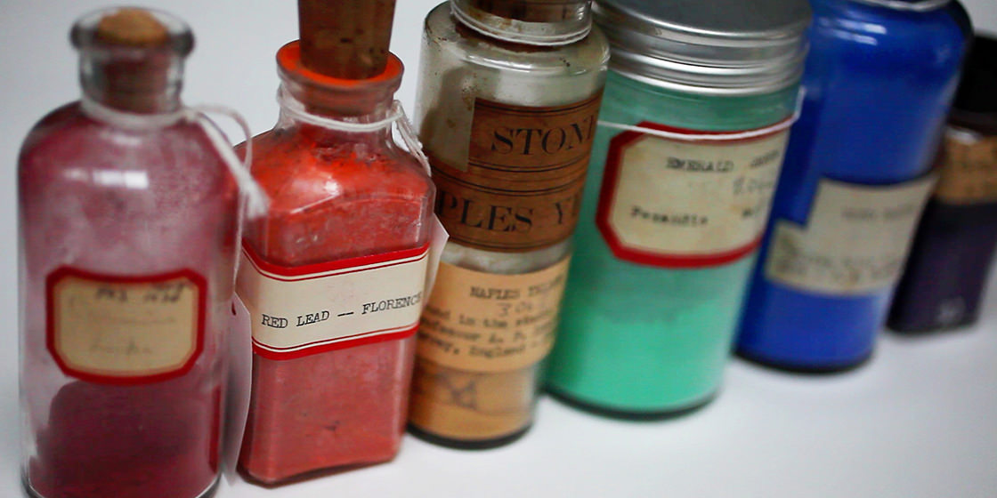
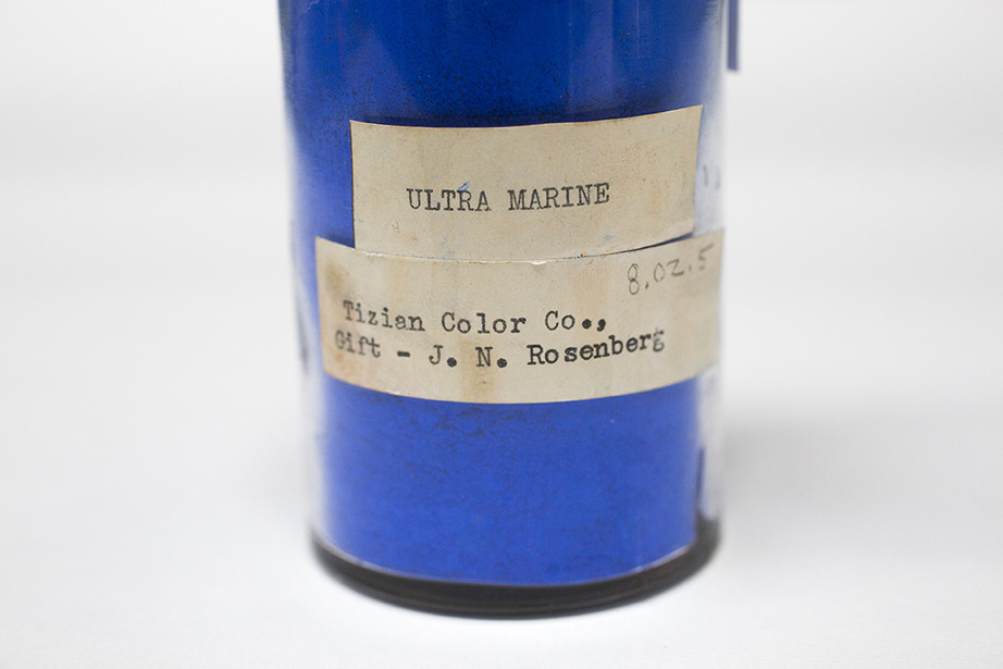
By the 1920s, Forbes had amassed containers of deep blues, rich purples, vibrant yellows, and myriad other colors from his travels to Europe and the Far East. Through the years, word of mouth helped the collection to grow as other art lovers and experts donated their own pigments. The museums’ collection, which is continually added to, now contains more than 2,500 samples and is renowned in the art community. For years, the pigments have helped art experts to research and authenticate paintings. Samples from the collection have been sent to the J. Paul Getty Museum, the Library of Congress, the Asian Art Museum of San Francisco, and the National Research Laboratory for Conservation of New Delhi, India.
In Cambridge, Forbes’ legacy thrives in the museums’ Straus Center for Conservation and Technical Studies, where experts preserve masterworks for future generations and decipher the chemical makeup of paint and pottery glaze. In addition to being their own artworks, Forbes’ pigments are a window to the past, shedding light on the working methods and preferred materials of renowned artists. Studying the pigments also reveals the effort it took, in the days before synthetic pigments, to get colors just right.
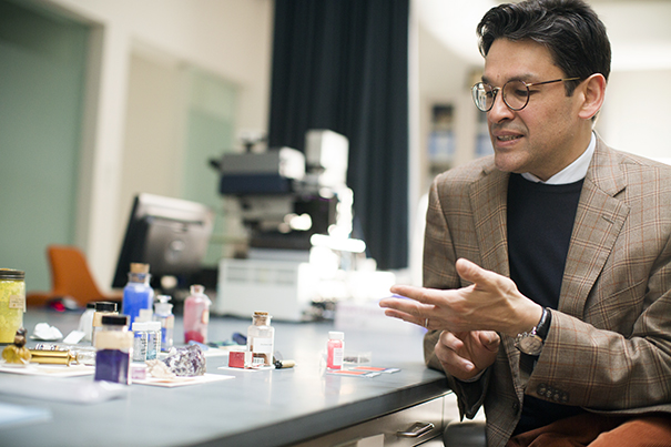
Earlier this year, Narayan Khandekar, the Straus Center’s new director, pulled out for inspection a selection of intense colors with curious backstories to share:
A piercing, precious blue
Skill was needed to extract the rich blue hue from the lapis lazuli stone mined from quarries in Afghanistan. Preparers carefully ground the precious rock into particles small enough to work with yet “large enough to contain the blue color,” said Khandekar, holding up a jar of intense deep-blue powder. The color was used in medieval paintings. More prized than gold, it “often warranted its own budget line in agreements.”
Synthetic blue
Director of the Straus Center for Conservation and Technical Studies Narayan Khandekar explains how the creation of a synthetic substance, which was chemically identical to the pigment produced from the semiprecious stone lapis lazuli, opened up a new world of blue hues to artists.
Pulling purple from the ocean floor
The key ingredient to another expensive pigment lurked in ocean waters. A secretion from the predatory sea snail Bolinus brandaris (originally known as Murex brandaris) provided the base for the deep, blue-red hue known as Tyrian purple, explained Khandekar. Its high cost rendered it a status symbol, and Byzantine emperors forbade anyone outside the imperial court from using the violet dye, lending it the distinction “royal purple.”

A priceless purple
Khandekar explains the aquatic origins of Tyrian purple.
Shiny, precious metal
There are small jars of shimmering metal pigments, often found in automotive finishes, that gradually made their way into 20th-century pop art. English painter and collage artist Richard Hamilton was fond of spraying the metal flakes, suspended in a binding medium, on his works to give his art a shining glow, said Khandekar. “They are kind of extraordinary, these tiny bits of metal that you find on various works.”
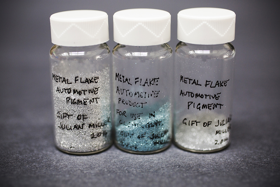
Metals in metallic paint
The use of tiny metallic flakes suspended in a binding medium can give artworks a shining finish.
Of crimson origin
There are samples of kermes, an Old World pigment created by grinding tiny blisters produced by the insects Coccus ilicis, which lived on the kermes oak tree. Harvard’s sports teams, students, and alumni everywhere owe a debt of gratitude to the little bugs: Kermes is also the source of the word “crimson.”
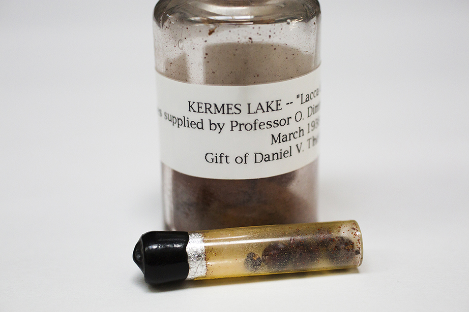
Kermes is for crimson
The rich kermes red pigment was created by grinding up the dried bodies of insects that lived on the kermes oak tree.
Deadly beauty
Some pigments must be handled with care, including the yellow-hued orpiment and the red-orange realgar, which are derived from arsenic sulfide minerals.
Similarly, the crystalline powder copper acetoarsenite, a brilliant shade of emerald green, could be hazardous to an artist’s health. The pigment produced the vibrant background found in the Fogg Museum’s “Self-Portrait Dedicated to Paul Gauguin” by Vincent van Gogh. But it was also highly toxic. Inexpensive to make, the color became a popular shade for household paint near the end of the 1800s and into the early 1900s, but its fumes could prove deadly. Later, the inorganic compound was used in insect repellant. “The ultimate intent is to get the right color,” said Khandekar, “but often artists will take great risks in doing so.”
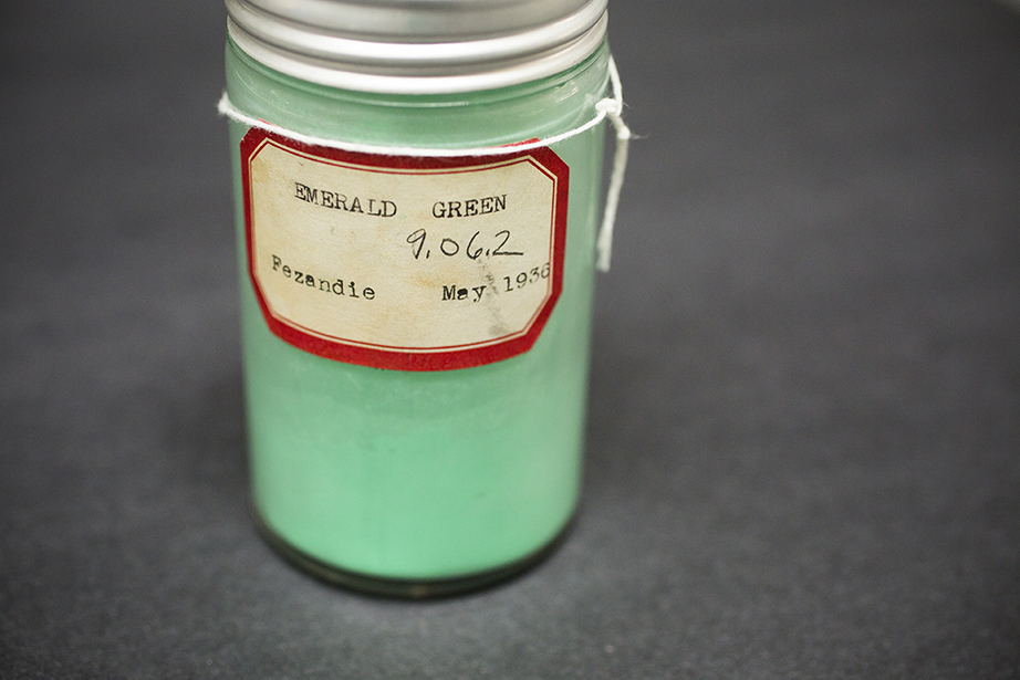

Green poison
Artists often took risks to create their works, using poisonous pigments like emerald green to get the color just right.

Cadmium yellow
Khandekar discusses the use of cadmium yellow by the Impressionists.
Red is for Rothko
In recent years, working with the collection helped experts to develop an innovative “virtual” restoration. After analyzing Lithol red, the pigment favored by abstract artist Mark Rothko, Khandekar and a team of scholars developed a technique that used light from a projector to augment the faded colors on a series of Rothko murals that the artist painted for Harvard.
“We found that when you tried to fade Lithol red as a powder, it was incredibly stable, but when you mixed it with ultramarine blue and a binding medium it became incredibly light-sensitive. Our analysis helped us understand what was going on with the paint,” said Khandekar. “To be able to treat and best look after works of art, you need to know all the things that are going on with them, and the Forbes Pigment Collection helps us do that.”