
Science & Tech
Visualization Lab provides data in three dimensions
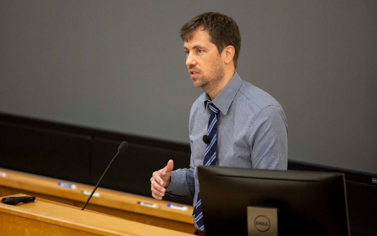
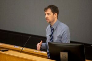
On the second floor of the Peabody Museum, in a darkened room painted flat black, Harvard geologist John Shaw slips on a pair of futuristic goggles as he sits before a 23-foot-wide wrap-around screen.
With a click of his mouse, a rotating yellow outline of Africa seems to jump off the screen and fill the small room. Globular columns of red magma lurking deep below most of the floating image slither in three dimensions up to volcanoes on the surface.
The southern tip of Africa appears to pass within easy arm’s reach as the 3-D representation slowly whirls in midair.
“It would be very hard to represent this in any kind of two-dimensional display,” says Shaw, Harry C. Dudley Professor of Structural and Economic Geology. “You end up having to show people 13 or 15 slices and try to let their brain do the work of composing this 3-D architecture.”
Despite what early explorers feared, the Earth is not flat. And that has long presented a challenge for geologists trying to model and study three-dimensional sections of the Earth’s crust on flat maps and computer screens.
The data used by Harvard’s Structural Geology and Earth Resources Group are no longer imprisoned in two dimensions, thanks to a new state-of-the-art immersive Visualization Lab, the first of its kind at Harvard and one of few in the world. Racks of powerful computers and graphics processors feed stereo images compiled from scientific data to three digital projectors suspended from the ceiling.
The stereo image looks blurry until you slip on the high-tech goggles, which, in a feat of precision timing, block one eye then the other in time with alternating left and right perspectives projected onto the 8-foot-tall screen. The result is a breathtakingly realistic 3-D image.
The system turns flat seismic reflection profile data — a swirl of orange and blue lines resembling a fingerprint in two dimensions — into a palpable block of Earth that can be spun, sliced, and bored into in search of hidden faults and domed layers of stone where petroleum typically collects. The underlying data is gathered by oil companies that set off explosive charges on the sea floor and then record the sound waves reflected back off the underground layers of rock.
“It sort of looks like Rorschach diagrams to some people, but to us there’s a lot of information here,” Shaw says, expertly tunneling into a block of modeled Earth to reveal the interior geography.
“It’s in applications like this that working with your standard flat-screen PC display simply fall completely short because they just don’t give you the freedom to slice and dice and view this information in any way you want to,” Shaw says.
The roughly $500,000 lab opened this past academic year. Its main function is to further the group’s work assessing earthquake hazards and supporting energy exploration, but the potential applications are far-reaching.
“We’ve talked about using it in archaeology,” says Harvard geologist and visualization lab manager George Planansky. “We figure we’re probably going to be using it with some of the fossil people for viewing dinosaur skulls, and some insect people, too. We’ve got physicists now using it to model DNA.”
The lab also was integrated into courses for undergraduate geology students this year with support of the Provost’s Fund for Innovation in Instructional Technology.
“There’s certainly a gee-wiz factor that works well and students appreciate, but that only lasts about 30 seconds,” Shaw says. “You need to make sure that there’s effective content that you’re presenting to them.”
Shaw introduces students to concepts in the visualization lab that they then pursue further in another standard computer lab downstairs.
“As scientists who work on this kind of data, we see new things almost every time we look at this,” he adds. “But it’s also very accessible to a first-year earth science student.”
Shaw worked for Texaco hunting for oil and gas reserves around the globe for five years before joining the Harvard faculty in 1997. While his research still includes energy exploration, he also focuses on protecting life and property in densely populated earthquake zones such as Japan and southern California through mapping of active seismic faults.
His group worked with the U.S. Geological Survey and other institutions to develop a fault model for California emergency planners.
The complex model brings together satellite images of southern California’s surface geography with seismic data represented as colored ribbons snaking deep underground. The ribbons represent the track and depth of active faults, while constellations of thousands of colored subsurface dots mark quakes and aftershocks going back 25 years.
The California Earthquake Authority, which sets insurance rates and adjusts building codes based on earthquake hazards, has adopted the model and will use it to generate the next generation of hazard maps, Shaw says.
Absent the ability to view the computer model in 3-D, it would be difficult if not impossible to appreciate the larger context of each potentially deadly fault. The system that makes the realistic visualization possible also allows scientists to perform intricate calculations to predict the amount of ground shaking that slippage on a particular fault might cause.
“We’ve had very senior seismologists and volcanologists here,” Planansky says, “and they were just gaga to see their data like this.”